
How To Draw A Colored Pencil Portrait
On LuxArchival Sanded Art Paper
Who said colored pencil portraits can’t be rendered quickly? Um, maybe I’ve said that in the past!
I’ve been changing my tune in the last few years. If you’re using sanded paper and this new LuxArchival paper in particular, then you can create colored pencil pieces within hours! Not the typical 40 to 100 hours. This particular demonstration took around 6 hours to complete!
Unheard of, right?!
For the 2-hour long version of this demo, join the Members Circle inside Monthly Sharpener!
For more info and to join the community, go here: https://monthly-sharpener.sharpenedartist.com/
In this demonstration you will learn how to render a colored pencil painting using a non-absorbent surface, called LuxArchival by brushandpencil.com
(Keep in mind that many of the techniques discussed are also applicable to traditional cotton paper.)
Click here to download the reference for this project.
The primary materials for this project are:
Paper - LuxArchival® Professional Sanded Art Paper, 8”x10”
Pencils - For this project I used:
Polychromos pencils by Faber-Castell
Pencil for line drawing - Any professional colored pencil brand, a Col-Erase pencil or an HB graphite pencil, and a kneaded eraser.
Waterbrush - For the background with the Neocolor II crayons.
Powder Blender - From BrushandPencil.com
Derwent Spritzer - For dampening your entire drawing surface.
Pastel Soft Tools - For blending mostly the so-called “oil” based colored pencils.
Princeton Artist Brush Synthetic Stiff Fix-It, Size 2 - This is also for moving the pencil around on the surface. This brush can actually move the “wax” based pencil pigment a little.
Afmat Battery Operated Eraser - I like this one because it has the smaller eraser nib and I use rechargeable batteries.
Looking for my colored pencil supply list? Go Here.
Techniques covered in this demonstration:
Composition considerations
Working on non-absorbent surfaces
Testing
Layering
Blending colors
Using a waterbrush
Inktense Underpainting
Using Powder Blender
Using water - soluble professional crayons for fast backgrounds.
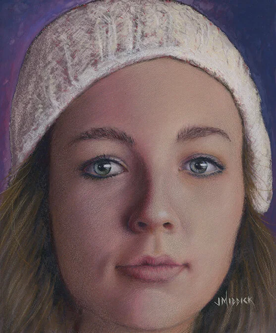
This demonstration piece is called “Dinah number 1”.
(I know, I’m Mr. Creative in my artwork titles!)
I have to say that this was such a FUN piece to work on!
So I'm excited to share it with you. If you decide to draw it, then comment down below your experience using these techniques!
This was one of the first projects I’ve done on this new LuxArchival paper and I am super impressed with it.
If you’d like a more in-depth article on this project, then check out the publication, CP Magic, in the February 2020 issue. Here’s the link to get your copy: https://www.carrie-lewis.com/downloads/cp-magic-magazine-february-2020/
It’s really a great magazine produced by my friend, and fellow colored pencil artist, Carrie Lewis. You can listen to Carrie’s podcast interview here!
If you are brand new to sanded paper then I want to encourage you to try it for yourself! It has sped up my process dramatically and has several advantages over cotton and other more traditional papers. The ability to draw lighter colors over dark ones, for example, is one such advantage.
I usually take my own reference photos because I want my artwork to be my own creative creation. So I’m constantly taking reference photos. I always encourage students to begin taking their own references and to be the originator of their own artwork.
Obviously, when you’re just starting out, or creating art purely for fun, then creating work from your own reference is not all that important.
But it does provide a level of satisfaction that is hard to describe!
Follow along using these simplified steps
to create this colored pencil portrait
Step 1 - Line Drawing for Outline and shading - using the Derwent Inktense Bark color.
In this piece, I decided to speed up the process by adding water to the surface. This allows you to move the inktense pencil around and create a dark under-painting.
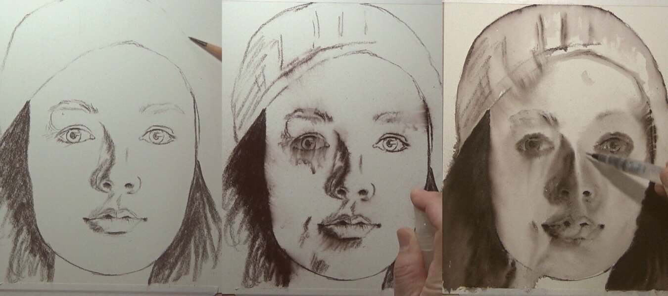
Step 2 - Establishing Darks and Lights - Organizing my range of values
Using Polychromos pencils like Caput Mortuum (and a few others) I re-established where the dark shadows are in the piece. I’m also using white to create the contrast to my darkest values. This allows me to arrange my values early in the piece. Now I know exactly how dark to go, and how light.
In this step I’m also adding color and detail in the eyes and begin using my local color for the skin.
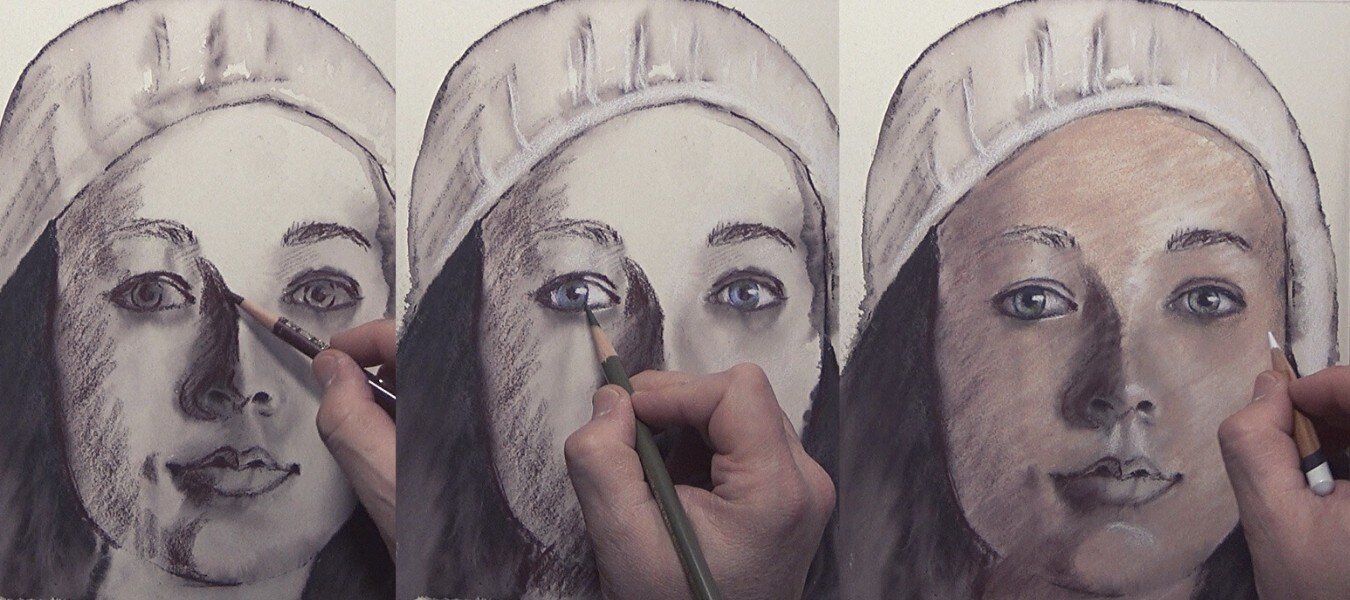
Step 3 - Focus on middle range values
I’m adding more pigment and trying to think less about color than I do values. I’m forcing my mind to think about the angles and shapes of each plane of the face.
I’m using Polychromos Ivory, and Caran D’Ache Burnt Ochre to add highlights and build up the light areas of the face.

Step 4 - Continue Defining and Refining
You’ll notice from the images below some “dust” on the surface. This is a normal part of the drawing process on sanded paper. There is less dust when using the LuxArchival paper, but you still have some.
I’m also adding a layer of pinks and reds to create more warmth in the skin tone.

Step 5 - Focus on the Mouth and the Hat
I usually build up all the areas of the face at the same time. But due to the complexity of the facial features (broadly the eyes, nose, and mouth) I will also work on them individually.

Step 6 - Adding Powder Blender
I used powder blender a couple of times throughout the drawing process to help blend the pencil strokes together and create a more even skin tone. You can watch the exact steps on the YouTube video above, or watch the 2-hour long version on Monthly Sharpener.

Step 7 - Final Touches
Near the end of the drawing I’m looking for anything that will help the overall composition. I’m looking for areas where I might be able to add more color, or more contrast, or anything else that might make the piece more appealing.
In this case I used the battery operated eraser to add an additional reflection in the eyes. I removed as much of the “black” in the eyes with the eraser, then using a white pencil I carefully add the white back in.

Step 8 - The Background
Once the portrait is done, and is looking just the way I want, it’s time to add a background to that will complement the subject.
I added a layer of three different colors (Bordeaux red, Prussian blue, and Periwinkle blue) of the Caran D’ache Neocolor II water-soluble crayon. I used a water brush to spread out the pigment and focused on creating the darkest value near the right side of the face so the contrast values of the piece would pop.
Lastly, I added more highlights to the hair by using Ivory and other light colors.
I signed the piece and sprayed with a final fixative coat.

— A quick word on backgrounds
I often get a few questions on backgrounds that sound something like this:
Q: I’ve heard you should do the background first before the completing the portrait, why or why isn’t that a good idea?
A: I think the biggest reason someone may do that (and even suggest you do that) is because they are trying to establish the value range. There may also be concerns about the temperature of the background and fears that it may lead your portrait to look “washed out”.
But the portrait IS the subject and needs to be able to communicate on it’s own and it should contain the resting area(s) for the composition. If you establish the value range in the portrait itself, then you also decide on the background as a secondary means of exploration. It’s not the primary focus and therefore, should not be your initial drawing effort.
If I have to establish my values based on the background then I am relying on something other than the main subject to dictate my composition. My first goal and focus for my piece is to create a compelling subject and the next priority is to use other things, like the background, to complement that primary focus.
Q: What color should I make the background and what if I “mess it up”?
A: Here’s the dirty little secrete to the “messing it up” problem; most of the time (about 99.9% of the time) you can “lean” or shift the color entirely in a new direction just by adding more layers! So problem solved there.
On the exact color question, I want to find colors that offer a nice complement to the overall color tone of my portrait. If there is an obvious opposite to the skin tone and overall temperature in the piece, then that’s a color option to consider.
If a background color is too elusive, and the task of deciding too daunting, then I’ve got a easy solution. Use the “Does this color go with my eyes” question! You probably recognize this question and may have even asked it yourself. If I am purchasing a new item of clothing, I am probably going to consider whether the color will be a complement to my skin tone and eye color. For example, if I have very faint features with a light skin complexion, then black would over-emphasize just how fair my skin is. I probably want to chose colors that are within a tonal range of the shadows of my subject. I need to look at the hair color, at the shadows in the face and then test. The key really is in testing a variety of different colors on a separate sheet of paper or in a photo editor to see what colors will work.
I’d love to hear your thoughts on this project and if you’ve tried this paper, I’d love to know your opinion! email me