How To Draw Cherries Tutorial Using Colored Pencil

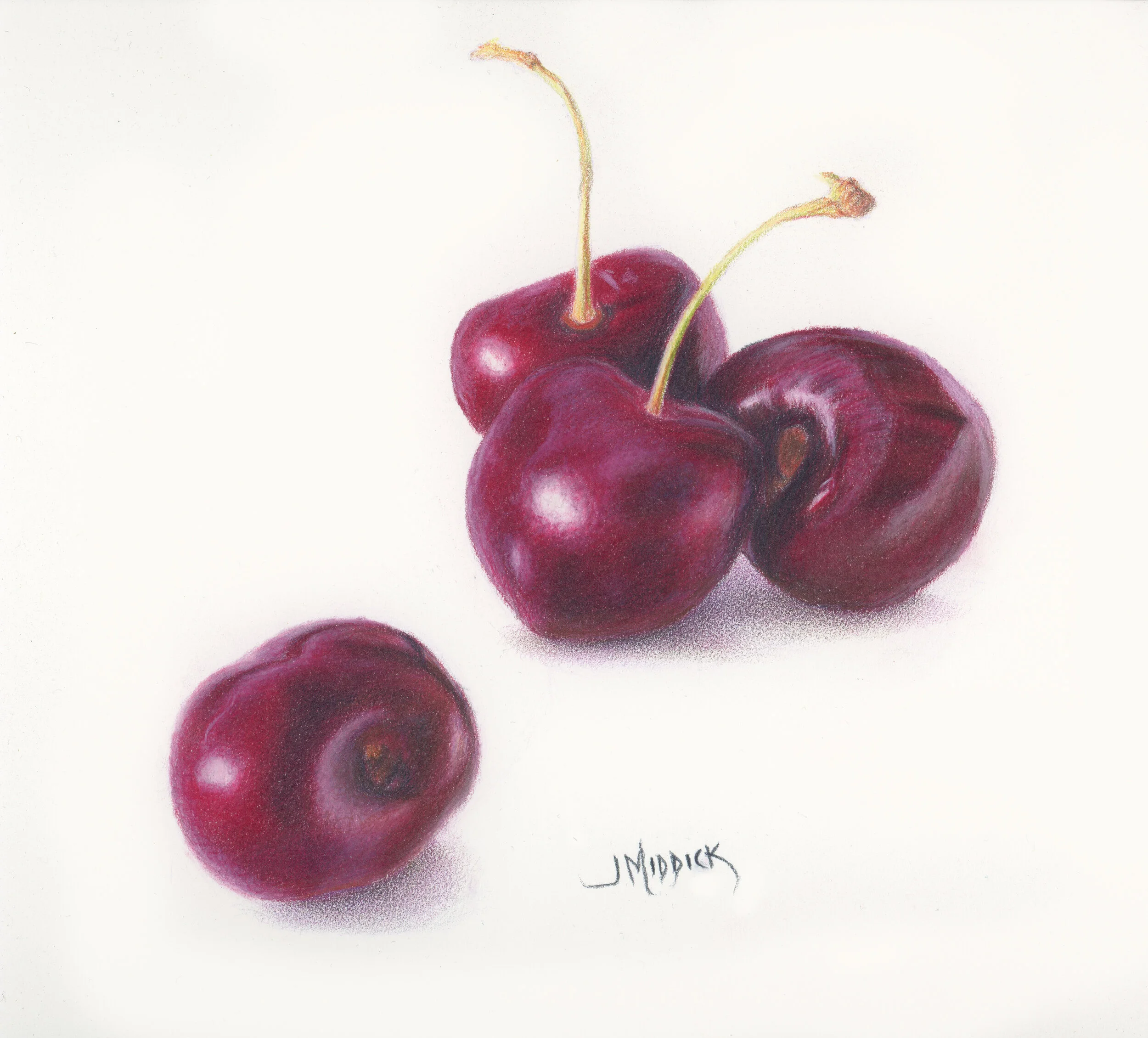
Dark Cherries Quartet

Dark Cherries Quartet

Drawing Cherries In Colored Pencil

On Stonehenge Paper

Using Polychromos Pencils By Faber-Castell


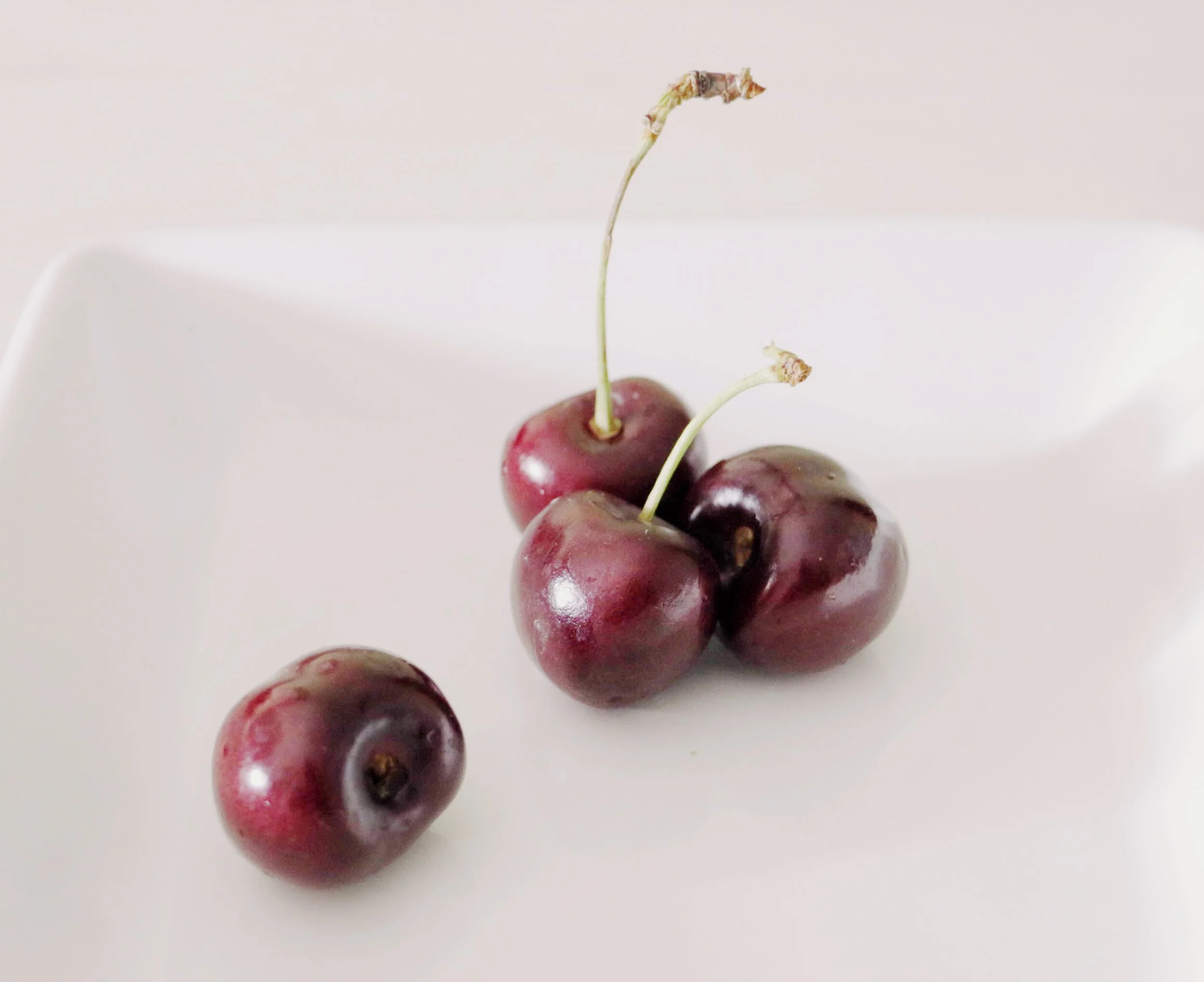
I took this reference photo after buying some cherries at the grocery store one afternoon. I laid them out on a plate and decided to grab my camera. The window light was hitting them in a way that revealed a lot of color and contrast! I just had to capture what I was seeing in a new art piece. I love those bits of inspiration that happen at random times!


Want to try your hand at this drawing?

Go here to download the reference photo.

How to draw Cherries reference photo


Composition Considerations

Before starting a new art piece, I ask myself the question: Will this reference help me make a compelling work of art?

If there are simple elements in the piece that need to be changed I’ll do it. On the other hand, if there’s a significant amount of changes required, then I’ll take reference shots all over again, noting the changes I need to make.

In the case of the Cherries reference, I decided that there was enough there to work with to create my artwork. I noted one small change to make to the direction of one of the stems. I decided to draw it pointing to the left rather than the right. This created a pleasing variation in the lines and overall composition.

How to create your line drawing

If you are brand new to art and don't feel comfortable creating your line drawing, feel free to use a ruler to get an exact placement for the elements in this piece.

Another simple way to just get started with a line drawing is to use a lightbox to trace the outline of your reference. This will generally shave off some of the upfront time in working out your line drawing. I like the Tikteck A4 Ultra-thin Portable LED Light Box Tracer.

Otherwise, simply freehand the cherries onto your drawing project and place them within the center (leaving enough margin around the edges to mat and frame the piece if you so choose). I like to use Prismacolor Col-erase pencils for the line drawing.

These cherries have a very glossy type of skin I wanted to use the burnishing technique to be able to show this texture. 

Which leads me to a popular question I often get…

What exactly IS burnishing?

An easy definition for burnishing is to press hard on your final layer to remove the white of the paper. You are smoothing the pencil layers.

Burnishing, as a word, technically means to polish by rubbing. The word actually comes from a word that means, “to brown”. In colored pencil art, you can create the appearance of glossy or shiny objects by using this technique.

Just know that burnishing and layering go hand in hand. When drawing on a good cotton paper, like Stonehenge paper by Legion, you have the option of building up multiple layers. Sometimes as many as 20 or more layers. If you like the polished look, then use the burnishing technique after you’ve completely rendered.

In colored pencil, burnishing can also happen when you’ve applied so many pencil layers and used heavy enough pressure to smooth the surface of the paper. This generally means the paper or surface you’re working on will not take more layers. If this happens unintentionally, it is sometimes referred to as accidental burnishing.

Accidental burnishing can limit your options and can damage the drawing surface. Once you’ve flattened out the tooth (the surface texture) of the paper it can be difficult or impossible to add more layers. Heavy pressure (or burnishing) too earlier in the process can also cause your surface to look unfinished. It can also leave white spots trapped under the multiple pencil layers.

The point of the pencil makes a big difference in the layering and burnishing process. So what about pencil burnishers and the different types there are to choose from?

Reasons to Burnish Colored Pencil Artwork

There is not a requirement on when or reasons to burnish colored pencil artwork. It comes down to a style choice. If you like a more saturated, polished look to your finished piece then you may choose to burnish.

What is the best Burnishing instrument?

There are many ways to get the job done when it comes to burnishing. Many pencil manufacturers make their own version of a burnishing pencil. These are pencils without color and mostly contain just the wax and/or oil found in a colored pencil. You may also choose to use another colored pencil as your burnisher.

The burnishing pencil I prefer most often is just using the last pencils in the colored pencil layering process. I also enjoy using the Full Bright Blender by Caran D’Ache. This blender is one full, solid stick without any wood.


I started out by first determining where the light source is coming from and where the shadows are cast.  I also made note of where the light and the shadow separations were within each element of the composition.


For the longer version of this video demonstration, join the Members Circle inside Monthly Sharpener! There’s no commitment or contract to stay. You can join for 1 month and then cancel.

For more info and to join the community, go here: https://monthly-sharpener.sharpenedartist.com


Click here to download the cherries photo reference for this project.

The primary materials for this project are:

  1. Paper - White Stonehenge paper, 8x8 inches. Legion website - the company that makes Stonehenge paper.

  2. Pencils - For this project I used these colors: a violet, dark indigo, alizarin crimson, orange, yellow, may green, white, ivory, and caput mortuum.

    A couple of Lightfast pencils by Derwent mostly white for burnishing, and a white Pablo pencil.

    I mostly used Polychromos pencils by Faber-Castell.

  3. Pencil for line drawing - The lavender color Col-Erase pencil, alternatively you could use an HB graphite pencil, and a kneaded eraser to lift the dark marks and leave just a hint of the outline.

  4. Erasers - A kneaded eraser, Alcolin Reusable Sticky Putty, and the Tombow MONO Sand Eraser.

    Looking for my usual colored pencil supply list? Go Here.


Follow along using these simplified steps

to create this cherries project


Step 1 - Create your line drawing

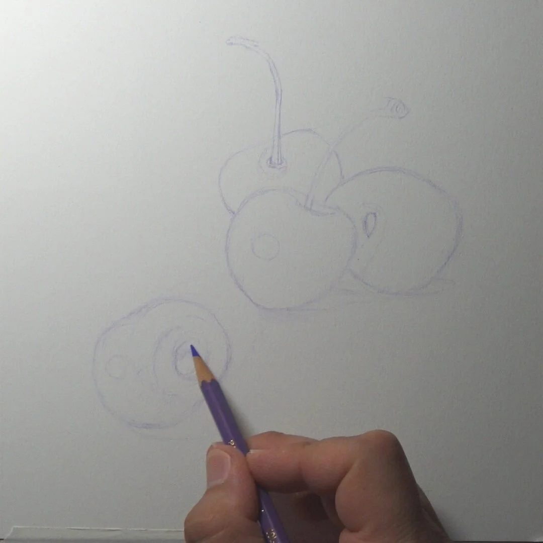
Create a line drawing with a Col-Erase colored pencil and use a very light touch. Draw the outlines of the major shadow shapes and the highlight reflections. in the piece and pay attention to the negative shapes and angles. At this point, you don’t want to look at details.

Remove some of the pencil by erasing the line drawing to leave just a faint image as a guide.

Cherries Drawing Line Drawing


Step 2 - Testing and deciding on your color palette

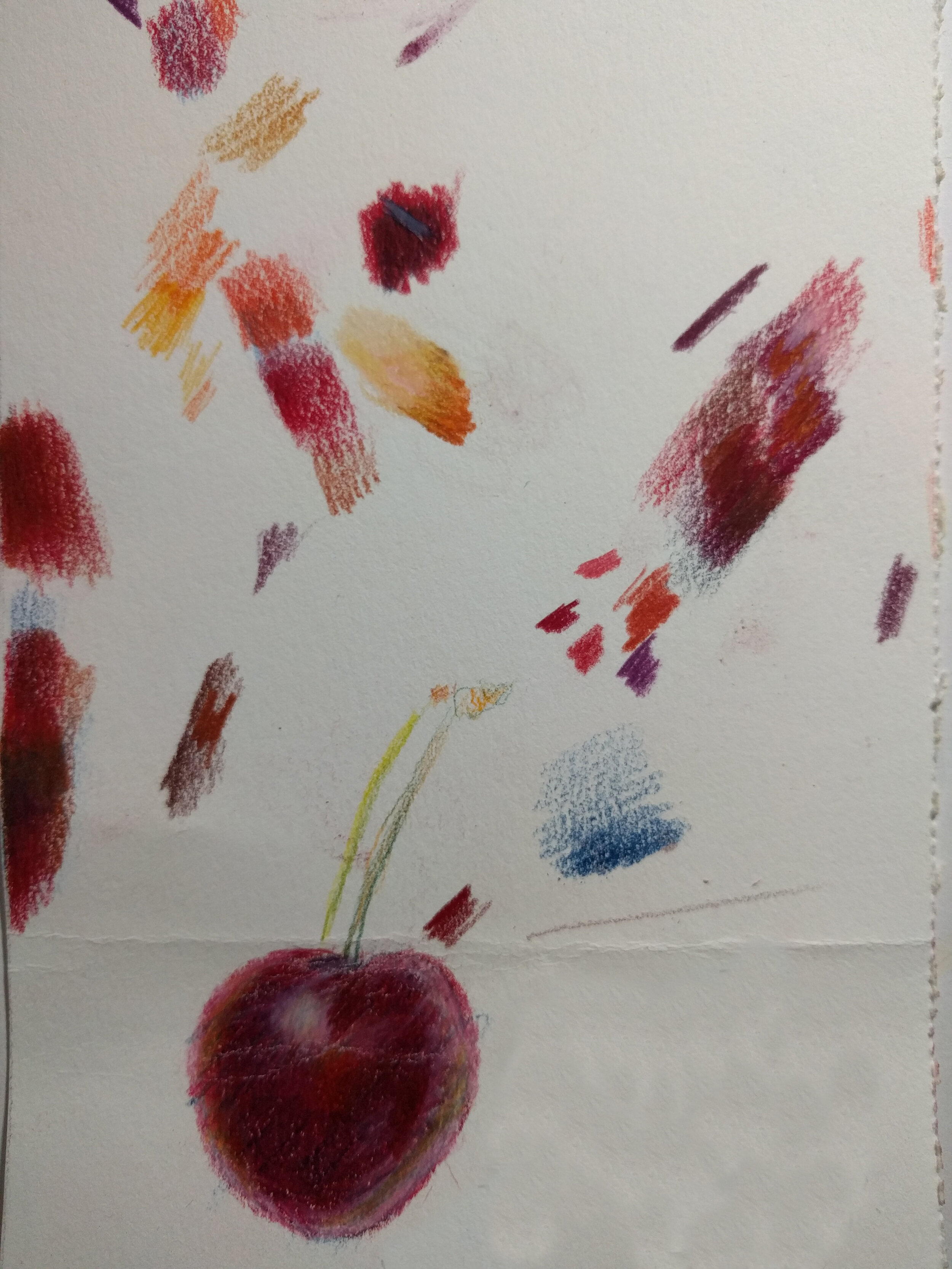
Unlike painting where you might mix your paint up on a palette, with colored pencil, I use a test sheet of paper to experiment. I can test different color recipes and decide the colors and the order in which I apply them.

Here’s what my test paper looked like this time:

testing colors for cherries project


You can watch the exact steps (just sped up) on the YouTube video above, or watch the 2-hour long version on Monthly Sharpener.

Step 3 - Adding the Local Color Underpainting

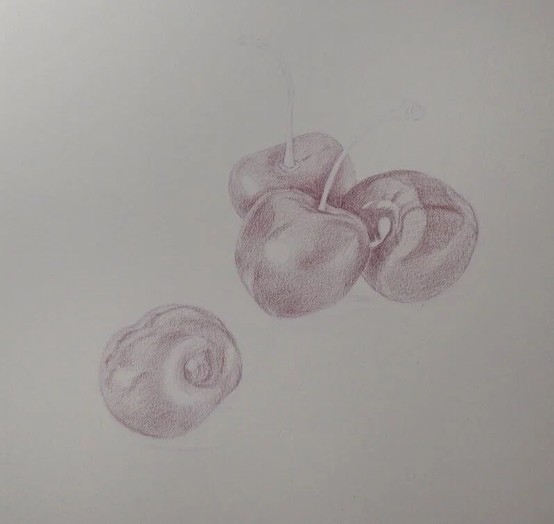
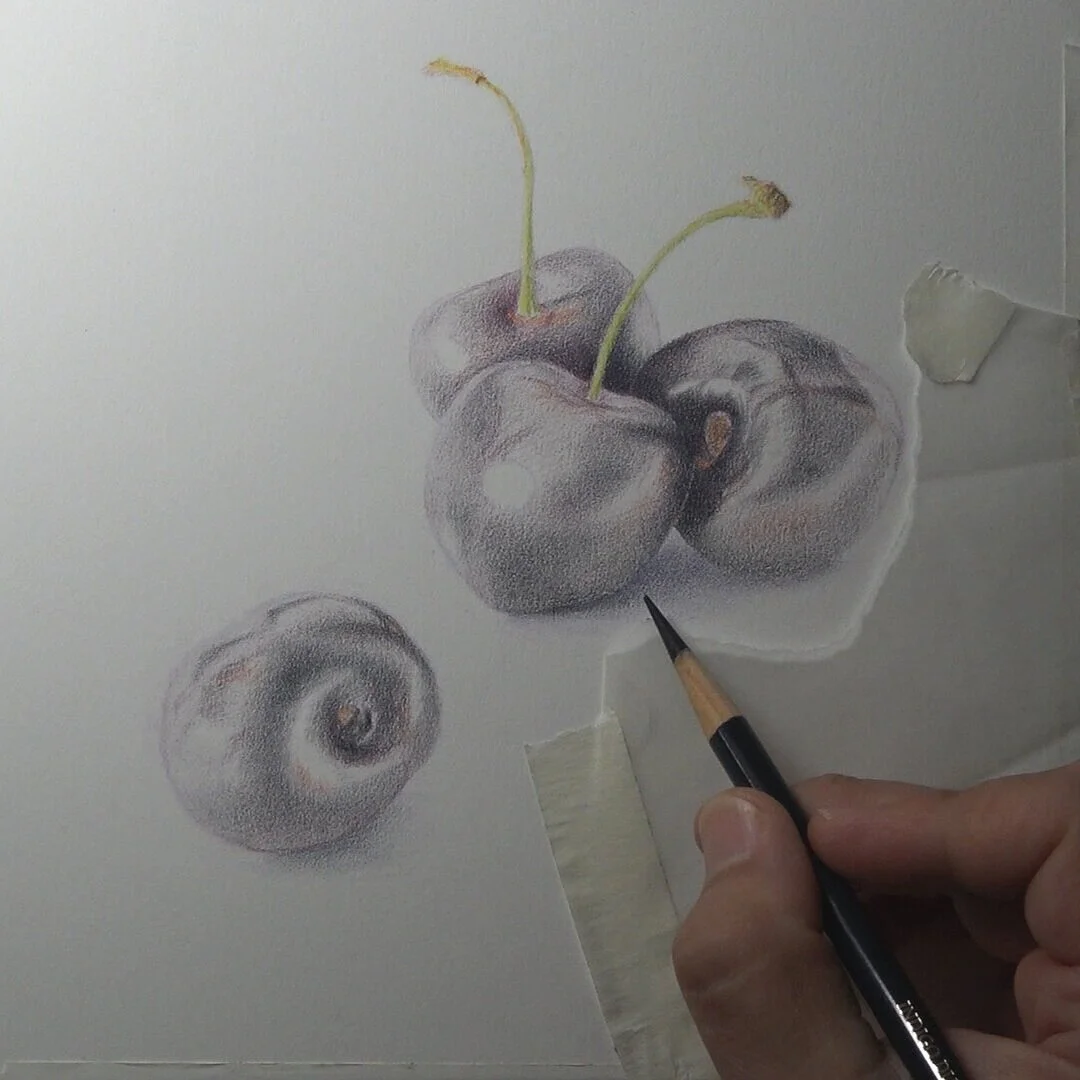
drawing cherries - adding the underpainting

I used magenta as my base color for the underpainting. Magenta is also the local color that I’ll use later for the final layers. I focused on the dark values and shadow changes on the skin of the fruits. Stonehenge paper has a very delicate tooth, so I was careful not to press too hard.

Step 4 - Add Dark Indigo and Orange

DarkIndigoHowtodrawcherries

I added dark indigo for my darkest color in the deepest shadows. I also added orange where some of the lighter values are, still using light pressure and a linear stroke with a very sharp pencil.

I reserved the brightest reflection areas by just being careful in those areas. I also added some yellow and may green to the stems. I used more yellow on the left side where the light source is reflected.

I also started to suggest some of the cast shadows by adding some blues and purples in the shadows.

Step 5 - Add Alizarin Crimson

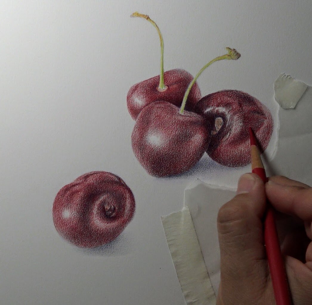
howtodrawcherries-alizarinchrimson.jpg

I added Alizarin Crimson (any other bright red would work) to cover the entire area of each cherries.

Note:  Consider areas where you might need to erase now.  As you begin to increase pressure in the following steps erasing will become less and less effective.


Step 6 - Add Caput Mortuum Violet (or Caput Mortuum)

DrawingCherries-CaputMortuumViolet.jpg

I added Caput Mortuum Violet mostly in the darkest areas, increasing the pencil pressure. 

Step 7 - Adding the local color again

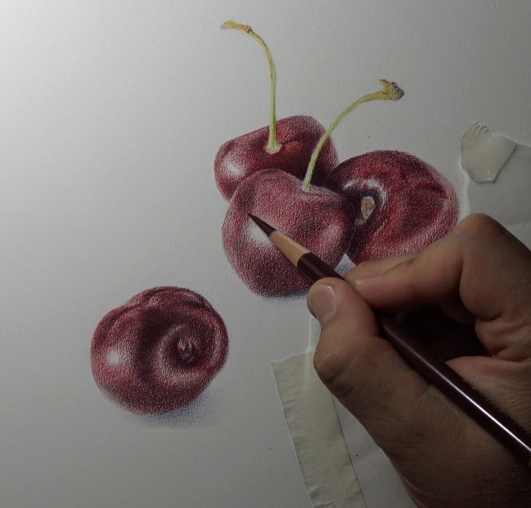
magenta 2nd time.jpg

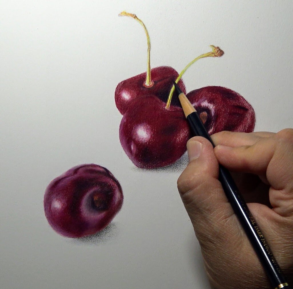
I added Magenta a second time and then I began to add white to the left side and Ivory to the right side of the cherries for the reflective light.

In these final stages of the drawing I kept going back and forth between the light and dark values. I continued to increase the pressure and burnish the cherry skins.

Step 11.jpg

How To Draw A Colored Pencil Portrait On LuxArchival Sanded Art Paper

LuxArchival Sanded Paper

How To Draw A Colored Pencil Portrait

On LuxArchival Sanded Art Paper


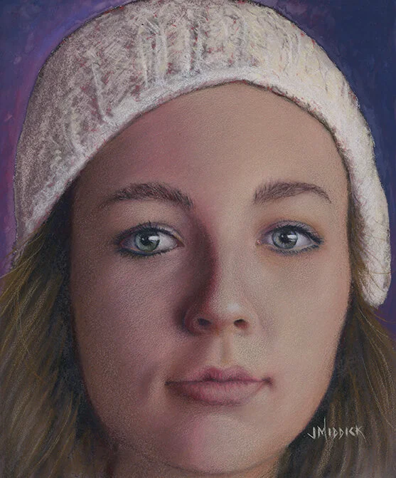
Who said colored pencil portraits can’t be rendered quickly? Um, maybe I’ve said that in the past!

I’ve been changing my tune in the last few years. If you’re using sanded paper and this new LuxArchival paper in particular, then you can create colored pencil pieces within hours! Not the typical 40 to 100 hours. This particular demonstration took around 6 hours to complete!

Unheard of, right?!


For the 2-hour long version of this demo, join the Members Circle inside Monthly Sharpener!

For more info and to join the community, go here: https://monthly-sharpener.sharpenedartist.com/

In this demonstration you will learn how to render a colored pencil painting using a non-absorbent surface, called LuxArchival by brushandpencil.com 

(Keep in mind that many of the techniques discussed are also applicable to traditional cotton paper.)


Click here to download the reference for this project.

The primary materials for this project are:

  1. Paper - LuxArchival® Professional Sanded Art Paper, 8”x10”

  2. Pencils - For this project I used:

    Lightfast pencils by Derwent

    Drawing pencils by Derwent

    Polychromos pencils by Faber-Castell

    Luminance pencils by Caran D’Ache

    Neocolor II by Caran D’Ache

  3. Pencil for line drawing - Any professional colored pencil brand, a Col-Erase pencil or an HB graphite pencil, and a kneaded eraser.

  4. Waterbrush - For the background with the Neocolor II crayons.

  5. Powder Blender - From BrushandPencil.com

  6. Derwent Spritzer - For dampening your entire drawing surface.

  7. Pastel Soft Tools - For blending mostly the so-called “oil” based colored pencils.

  8. Princeton Artist Brush Synthetic Stiff Fix-It, Size 2 - This is also for moving the pencil around on the surface. This brush can actually move the “wax” based pencil pigment a little.

  9. Afmat Battery Operated Eraser - I like this one because it has the smaller eraser nib and I use rechargeable batteries.

Looking for my colored pencil supply list? Go Here.

Techniques covered in this demonstration:

  1. Composition considerations

  2. Working on non-absorbent surfaces 

  3. Testing

  4. Layering

  5. Blending colors

  6. Using a waterbrush

  7. Inktense Underpainting

  8. Using Powder Blender

  9. Using water - soluble professional crayons for fast backgrounds.

This demonstration piece is called “Dinah number 1”.

(I know, I’m Mr. Creative in my artwork titles!)

I have to say that this was such a FUN piece to work on!

So I'm excited to share it with you. If you decide to draw it, then comment down below your experience using these techniques!

This was one of the first projects I’ve done on this new LuxArchival paper and I am super impressed with it.


If you’d like a more in-depth article on this project, then check out the publication, CP Magic, in the February 2020 issue. Here’s the link to get your copy: https://www.carrie-lewis.com/downloads/cp-magic-magazine-february-2020/

It’s really a great magazine produced by my friend, and fellow colored pencil artist, Carrie Lewis. You can listen to Carrie’s podcast interview here!


If you are brand new to sanded paper then I want to encourage you to try it for yourself! It has sped up my process dramatically and has several advantages over cotton and other more traditional papers. The ability to draw lighter colors over dark ones, for example, is one such advantage. 

I usually take my own reference photos because I want my artwork to be my own creative creation.  So I’m constantly taking reference photos.  I always encourage students to begin taking their own references and to be the originator of their own artwork. 

Obviously, when you’re just starting out, or creating art purely for fun, then creating work from your own reference is not all that important.

But it does provide a level of satisfaction that is hard to describe!


Follow along using these simplified steps

to create this colored pencil portrait

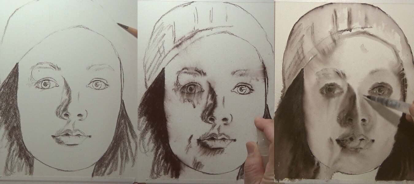
Step 1 - Line Drawing for Outline and shading - using the Derwent Inktense Bark color.  

In this piece, I decided to speed up the process by adding water to the surface. This allows you to move the inktense pencil around and create a dark under-painting.

LuxArchival Inktense - Colored Pencil.jpg

Step 2 - Establishing Darks and Lights - Organizing my range of values

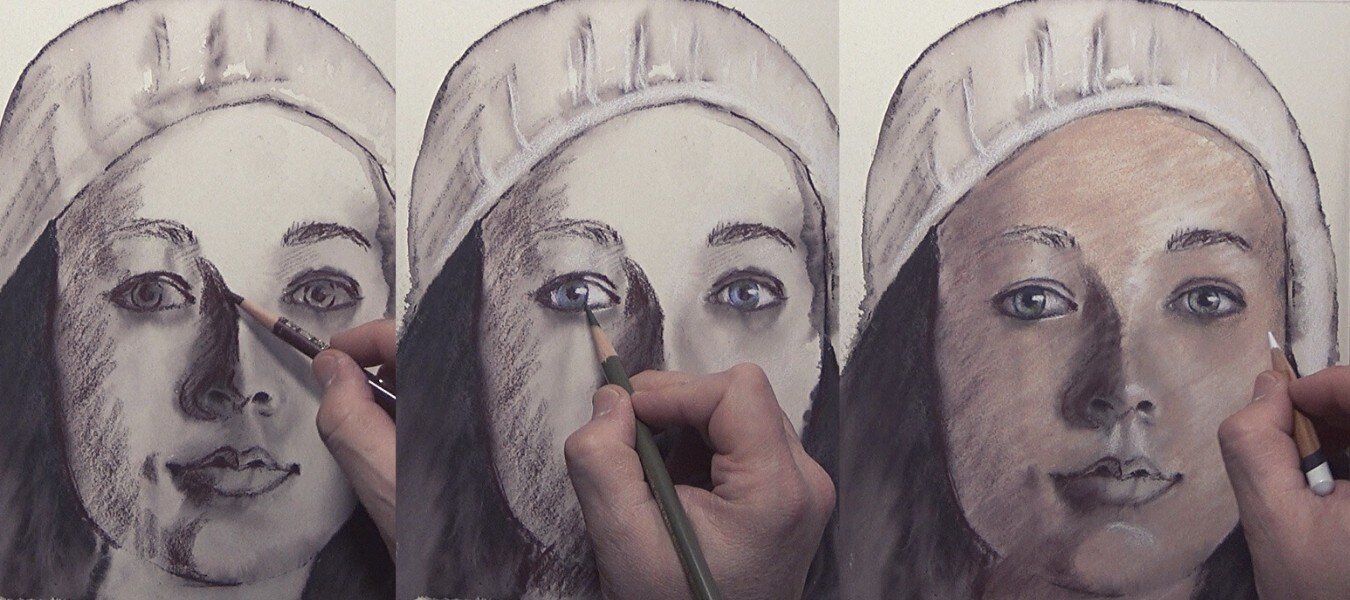
Using Polychromos pencils like Caput Mortuum (and a few others) I re-established where the dark shadows are in the piece. I’m also using white to create the contrast to my darkest values. This allows me to arrange my values early in the piece. Now I know exactly how dark to go, and how light.

In this step I’m also adding color and detail in the eyes and begin using my local color for the skin.

Copy of LuxArchival - Portrait Dinah II (1).jpg

Step 3 - Focus on middle range values

I’m adding more pigment and trying to think less about color than I do values. I’m forcing my mind to think about the angles and shapes of each plane of the face.

I’m using Polychromos Ivory, and Caran D’Ache Burnt Ochre to add highlights and build up the light areas of the face.

LuxArchival - Portrait Dinah III.jpg

Step 4 - Continue Defining and Refining

You’ll notice from the images below some “dust” on the surface. This is a normal part of the drawing process on sanded paper. There is less dust when using the LuxArchival paper, but you still have some.

I’m also adding a layer of pinks and reds to create more warmth in the skin tone.

LuxArchival - Portrait Dinah IV.jpg

Step 5 - Focus on the Mouth and the Hat

I usually build up all the areas of the face at the same time. But due to the complexity of the facial features (broadly the eyes, nose, and mouth) I will also work on them individually.

LuxArchival - Portrait Dinah V.jpg

Step 6 - Adding Powder Blender

I used powder blender a couple of times throughout the drawing process to help blend the pencil strokes together and create a more even skin tone. You can watch the exact steps on the YouTube video above, or watch the 2-hour long version on Monthly Sharpener.

LuxArchival - Portrait Dinah VII.jpg

Step 7 - Final Touches

Near the end of the drawing I’m looking for anything that will help the overall composition. I’m looking for areas where I might be able to add more color, or more contrast, or anything else that might make the piece more appealing.

In this case I used the battery operated eraser to add an additional reflection in the eyes. I removed as much of the “black” in the eyes with the eraser, then using a white pencil I carefully add the white back in.

LuxArchival - Portrait Dinah VIII.jpg

Step 8 - The Background

Once the portrait is done, and is looking just the way I want, it’s time to add a background to that will complement the subject.

I added a layer of three different colors (Bordeaux red, Prussian blue, and Periwinkle blue) of the Caran D’ache Neocolor II water-soluble crayon.  I used a water brush to spread out the pigment and focused on creating the darkest value near the right side of the face so the contrast values of the piece would pop. 

Lastly, I added more highlights to the hair by using Ivory and other light colors.

I signed the piece and sprayed with a final fixative coat.

LuxArchival - Portrait Dinah IX.jpg

— A quick word on backgrounds

I often get a few questions on backgrounds that sound something like this:

Q: I’ve heard you should do the background first before the completing the portrait, why or why isn’t that a good idea?

A: I think the biggest reason someone may do that (and even suggest you do that) is because they are trying to establish the value range. There may also be concerns about the temperature of the background and fears that it may lead your portrait to look “washed out”.

But the portrait IS the subject and needs to be able to communicate on it’s own and it should contain the resting area(s) for the composition. If you establish the value range in the portrait itself, then you also decide on the background as a secondary means of exploration. It’s not the primary focus and therefore, should not be your initial drawing effort.

If I have to establish my values based on the background then I am relying on something other than the main subject to dictate my composition. My first goal and focus for my piece is to create a compelling subject and the next priority is to use other things, like the background, to complement that primary focus.

Q: What color should I make the background and what if I “mess it up”?

A: Here’s the dirty little secrete to the “messing it up” problem; most of the time (about 99.9% of the time) you can “lean” or shift the color entirely in a new direction just by adding more layers! So problem solved there.

On the exact color question, I want to find colors that offer a nice complement to the overall color tone of my portrait. If there is an obvious opposite to the skin tone and overall temperature in the piece, then that’s a color option to consider.

If a background color is too elusive, and the task of deciding too daunting, then I’ve got a easy solution. Use the “Does this color go with my eyes” question! You probably recognize this question and may have even asked it yourself. If I am purchasing a new item of clothing, I am probably going to consider whether the color will be a complement to my skin tone and eye color. For example, if I have very faint features with a light skin complexion, then black would over-emphasize just how fair my skin is. I probably want to chose colors that are within a tonal range of the shadows of my subject. I need to look at the hair color, at the shadows in the face and then test. The key really is in testing a variety of different colors on a separate sheet of paper or in a photo editor to see what colors will work.

I’ve written more about backgrounds considerations here.


I’d love to hear your thoughts on this project and if you’ve tried this paper, I’d love to know your opinion! email me

A Quick Guide For Using Colored Pencil On Pastelmat

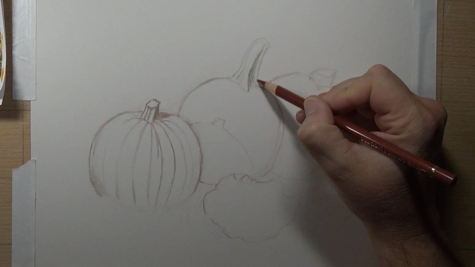
Field Pumpkins - Final II.jpg

Drawing Field Pumpkins On Pastelmat by Clairefontaine

with Colored Pencil


For the 2-hour long version of this demo, join the Members Circle inside Monthly Sharpener!

For more info and to join the community, go here: https://monthly-sharpener.sharpenedartist.com/

In this demonstration you will learn how to render a colored pencil painting using a non-absorbent surface, called Pastelmat by Clairefontaine.  You could use a sandpaper surface which is also a non-absorbent surface. The techniques will work on any non-absorbent surface but I’ll discuss some of the differences a little later on.


The biggest difference between using solvent on Pastelmat versus a traditional cotton paper like Stonehenge is you are able to move the medium around on the surface more.

In fact, on this paper you can move the pigment around using solvent better than you can on any other surface!

The color pencil medium becomes more of a painting medium and is extremely fluid when solvent is applied.


Click here to download the reference for this project.


The primary materials for this project are:

  1. Paper - Pastelmat by Clairefontaine approximately 9"x12" (sizes are in centimeters)

  2. Pencils - For this project I used:

    Lightfast pencils by Derwent

    Drawing pencils by Derwent

    Polychromos pencils by Faber-Castell

    Luminance pencils by Caran D’Ache

  3. Pencil for line drawing - Any professional colored pencil brand, a Col-Erase pencil or an HB graphite pencil, and a kneaded eraser, and battery operated eraser.

  4. Solvent - Also referred to as Odorless Mineral Spirits (OMS) - I recommend Gamsol by Gamblin.

Click here for my recommendations on Materials for Colored Pencil work.

Techniques covered:

  1. Composition considerations

  2. Working on non-absorbent surfaces 

  3. Testing

  4. Layering

  5. Blending colors

  6. Burnishing

  7. Using Solvent


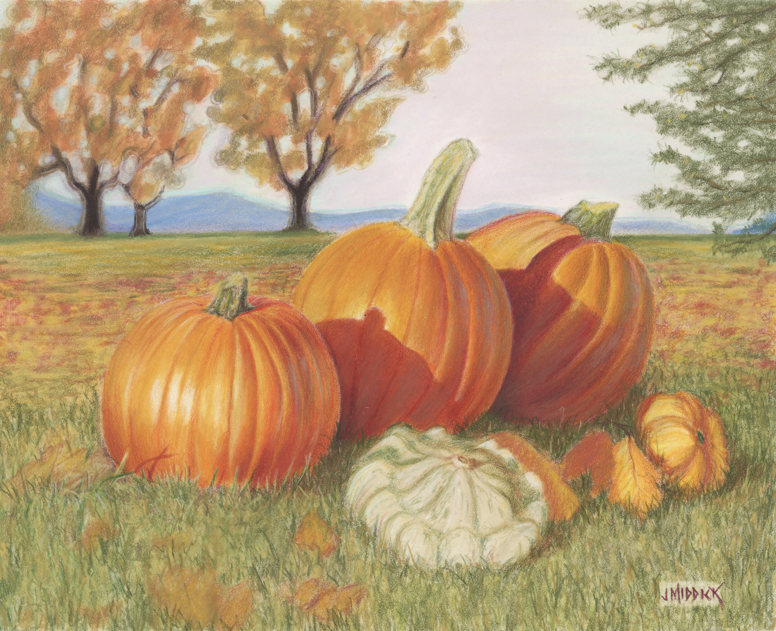
The title of this demonstration piece is “Field Pumpkins number 1”.

Using a rigid surface means that the pencil pigment will adhere to the surface much faster than it would on a cotton paper. Using solvent on a non-absorbent surface also allows you to lengthen the brushstrokes of the pigment more easily.  The liquid travels farther and is much more fluid.

The advantage for you as a Creator is that you can render artwork much faster and you can achieve a more painterly style if that's what you're after.  OR you can create very realistic work if you work in layers and create your final layers of detail with razor-sharp pencils.


In this art piece, I’m using a photo-realism effect by narrowing the field of focus.  I placed these pumpkins in the grass and took the reference with a 50mm lens. I’m changing the background to depict distance.  


Step 1 - Line drawing and (roadmap and color choices)

Sketch out your line drawing

1+Line+Drawing.jpg


Start out by sketching your outline very lightly to create a roadmap. 

You may decide to draw some small Thumbnail sketches in a notepad first to determine the overall composition before landing on your project. 

Decide On Your Color Palette

Work out your color selections on a test sheet of paper before beginning your project. For this project I selected some very warm oranges, yellows, reds, and greens. 

Note: One of the major differences between color pencil and other art mediums is you're mixing your colors right on your project. So determining the color choices ahead of time is critical. 

Step 2 - Add More color to sharpen up the line drawing

2+Complete+Some+Details.jpg


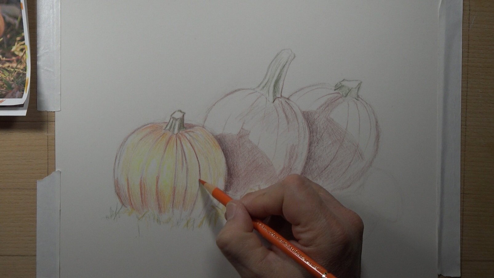
Step 3 - Add initial layers of color.  Red for shadows and yellow in the lightest areas, and orange for a local color.

3.jpg
5.jpg


Once you've determined the colors you will use in the composition, begin applying the local color, the dark contrast and yellow to the highlights in the pumpkins. 

I chose to add red in the darkest shadow areas (that’s the dark contrast). I’m using solvent to speed up the coverage of the pigment. 

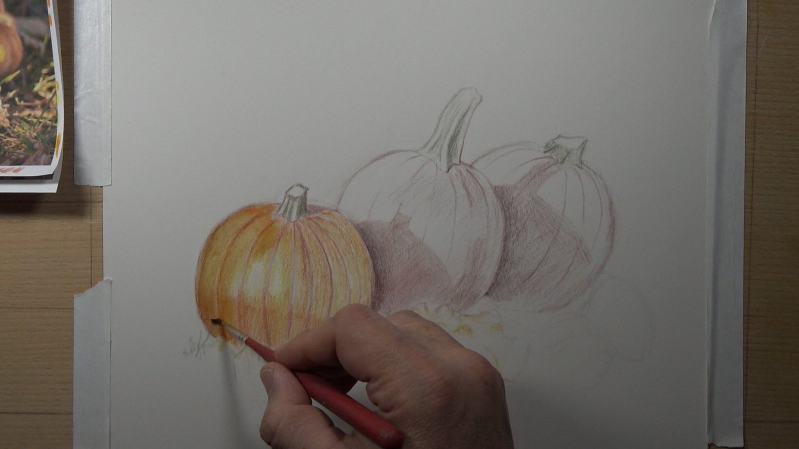
Note: When using solvent you have to make sure that it dries completely before adding more layers of pencil. If you don't do this then you will create indentations (depressed lines) in your work that cannot be removed. This is particularly difficult on cotton paper.  Pastelmat and other non-absorbent surfaces are more forgiving with this, but it can still happen. So be careful!


Step 4 - Add solvent to the pumpkin, the shadows, and to the stem

6.jpg
6.2+add+green+to+stems+and+solvent.jpg


Step 5 - Add another layer of orange and solvent

7.jpg
8.jpg
9.jpg

While you're waiting for an area to dry you should skip to another area of the composition.

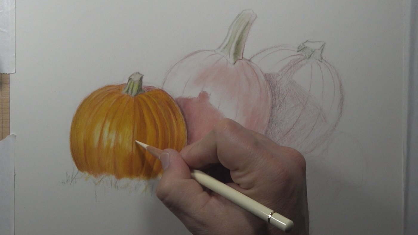
Step 6 - Increase the dark and light contrast

10+-+shadows+in+pumpkin+ridges.jpg
11 - add ivory for lighter areas.jpg

Add more light colors and dark colors.  Pay close attention to the way light travels across the form of the pumpkin (the ribs) and create the middle values with subtle transitions.  

Step 7 - Add more red and more caput mortuum and indigo in the shadows

14+-+Add+Caput+Mortum.jpg


Step 8 - Add a horizon line and a loose sketch of a tree in the background

16+-+Add+a+horizon+line.jpg


Step 9 - Add more trees, color in the sky, and add blue hills

17+-+Add+trees+to+the+background.jpg


Step 10 - Add more grass to the background and foreground, then add fallen leaves in the middleground

25+-+Add+the+foreground+grass.jpg


Interested in watching the complete 2 hour long demonstration video? Go to the Monthly Sharpener community and signup for the Members Circle.

Learn more here: Monthly Sharpener, Members Circle

For the complete 7-hour long course where I show you the complete process from start to finish go here:

Click here for the Pumpkins on Pastelmat Course!

Note: One technique to help keep you focused throughout the drawing is to keep moving back and forth between different areas.   So switch between the foreground, middleground, and background often. 
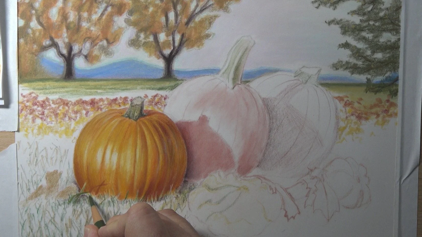
Keep working on the drawing until it looks the way you want.  Each time you draw you will see things you never saw before. You will also gain a greater understanding and mastery of your medium. 

Be patient with yourself and enjoy the process! 

Drawing A Dark Skin Toned, Female Mouth

Drawing Dark Skin Tones On A Female Mouth.jpg

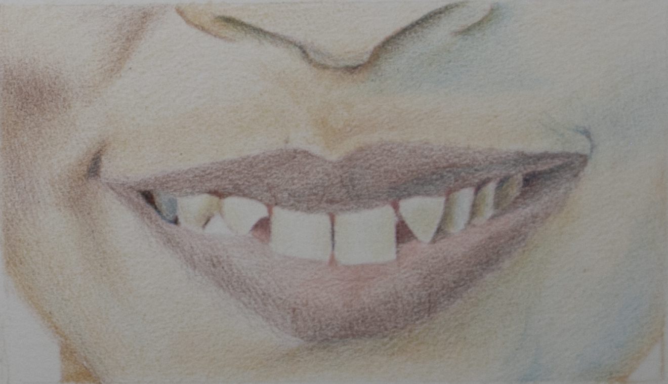
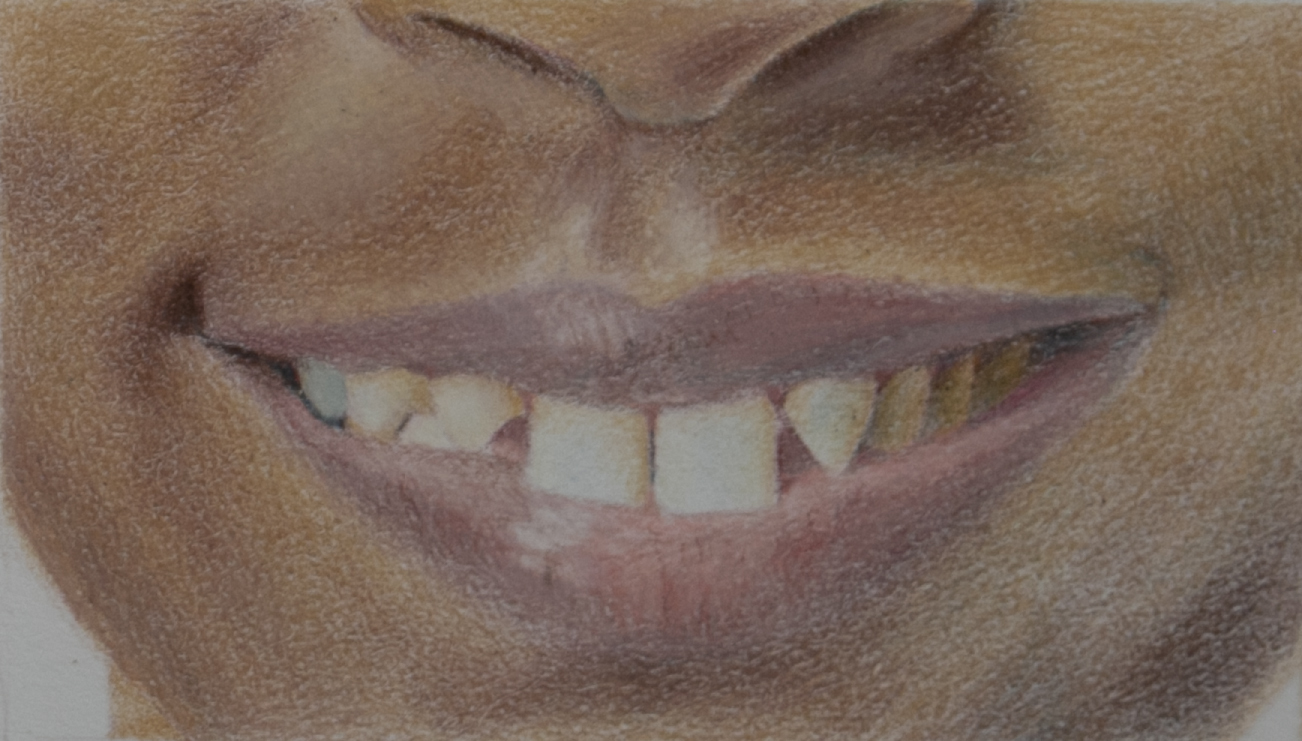
In this tutorial I walk you through how to draw a mouth with teeth.  The reference photo below is yours to use and print out to draw from. Enjoy!

As a new artist, it’s all-too-common to be terrified of drawing teeth in a portrait, doing everything to avoid the task. (I’m raising my hand here, too!) But it doesn’t have to be so scary, even if you’re brand new to colored pencil. You can tackle this subject matter early on in your artistic development, and today I’m going to walk you through the process.


Before you do anything else, transfer your line image over to your paper. You can easily trace this by placing the line image underneath your paper and then use a Col-Erase pencil (my personal favorite) to trace your line drawing. I usually start out with a Col-Erase pencil whether or not I am tracing my line image, because it allows me to fully erase what I'm putting down on the paper in case I make a mistake. And let’s be real -- there are lots of mistakes!

Here’s the Part 1 video of this drawing!

Step One

Once you have your line drawing on your paper, it's time to start adding some color. This will give you some context for understanding the relationships of the objects and your drawing.

You can begin by using Phthalo Blue for all the recessed areas or spaces in between the teeth that indicate shadows. This will allow you to determine the shape of each tooth more clearly.  You’ll also want to add blue to most of the teeth that are inside a shadow area and are not catching the light.

Add a base coat of Brown Ochre 50% to the skin around the mouth with very light pressure, which acts as a reference point for your color from the very beginning— we don’t want you staring at a white page and feeling overwhelmed when you start choosing your colors! Add Burnt Sienna to the lips, varying your pressure in to create a dimensional look that will be more convincing.

Turn your attention back to the teeth and add the Brown Ochre and Olive Brown to create the illusion of a contour in the teeth. There’s no need to worry if the teeth are too dark or too yellow in certain areas at this point -- you can lighten that up later.

Step Two

Step 2.jpg

Since the light in this photograph is coming from the left, make sure all of the shadows on the left are warmer in color. The shadows on the right side of the mouth are further away from the light source and will represent deeper shadows, so you can use blue as your opposite color.

Go ahead and add Phthalo Blue in most of the darkest shadow areas, then increase some of the contours of the face on the left using Burnt Sienna and Burnt Sienna 50%.  Be very careful not to press too hard and burnish too early because, since that will limit your ability to add as many layers!

Remember: Always think light, slow layers of color that build up slowly over time.  

Step Three

Step 3.jpg

Add more Burnt Sienna and blue in the lips to deepen the value and contrast with the white of the teeth. If you’re constantly thinking about the values and building them up slowly, you’ll keep them balanced.  

If you’ve made it this far, you’re about halfway there. Congratulations -- you’ve reached the “ugly stage!” Things might not look so pretty right now, since many of the values and colors or hues will start to become a little unbalanced and look odd. Don't be discouraged by this -- it’s completely normal. Just keep your mind focused on what the end result will eventually look like!


Step Four


At this stage, it’s time to add another base layer to the skin -- this time using Brown Ochre.Think about the values the entire time and make sure that you’re also adding Burnt Sienna to most of the shadows at the same time that you’re adding the Brown Ochre. I usually keep both of these pencils in my hands at the same time and keep alternating between one and the other.  

Step Five


Once you’ve added that second base layer of Brown Ochre to the skin you can see how the teeth now suddenly look very bright compared to our previous step. This illustrates that the values are staying balanced, which is the best way to build up a drawing. Continue going back and forth between the teeth and the skin to bring all these layers up -- slowly, of course!

Step Six


As you’re getting towards the final layers of the drawing, use an electric eraser to create some highlights for the reflections in both the skin above the mouth and on the lips themselves. Once you’ve removed the pigment from those areas, go back in and use mostly Buff Titanium and a little bit of White.

Add yet another layer of Burnt Sienna to the contoured areas of the skin and a layer of Brown Ochre to the teeth in the shadowed area on the right side of the mouth.

Step Seven

Step 7.jpg


Now add Payne's Grey 50% to the teeth on the right, and more Phthalo Blue to the face on the right side in the shadows.

Next up? A layer of Phthalo Blue to the background, then Crimson Alizarin on top of that, and finally Sepia 50%.


Step Eight

Step 8 - Final Touches.jpg

At last, we’ve reached my favorite part of the drawing process: the final touches where you get to examine what may need to be improved!

In this example, I found that I needed to add a very light layer of Cobalt Blue to all the teeth, especially the front two teeth. I also decided to increase most of the shadows in the face, then added Sepia 50% on top of most of the shadows. The darkest areas for the right side of the face got one last layer of Phthalo Blue as well.

How did you do? Stand back from the drawing several feet to evaluate and determine if the illusion of “white” teeth is convincing. Chances are, you’ve created a pretty realistic mouth, and you didn’t even have to avoid the teeth this time!

You can apply a similar process to your future drawings by remembering that color is always relative to the colors next to it. You can do this!


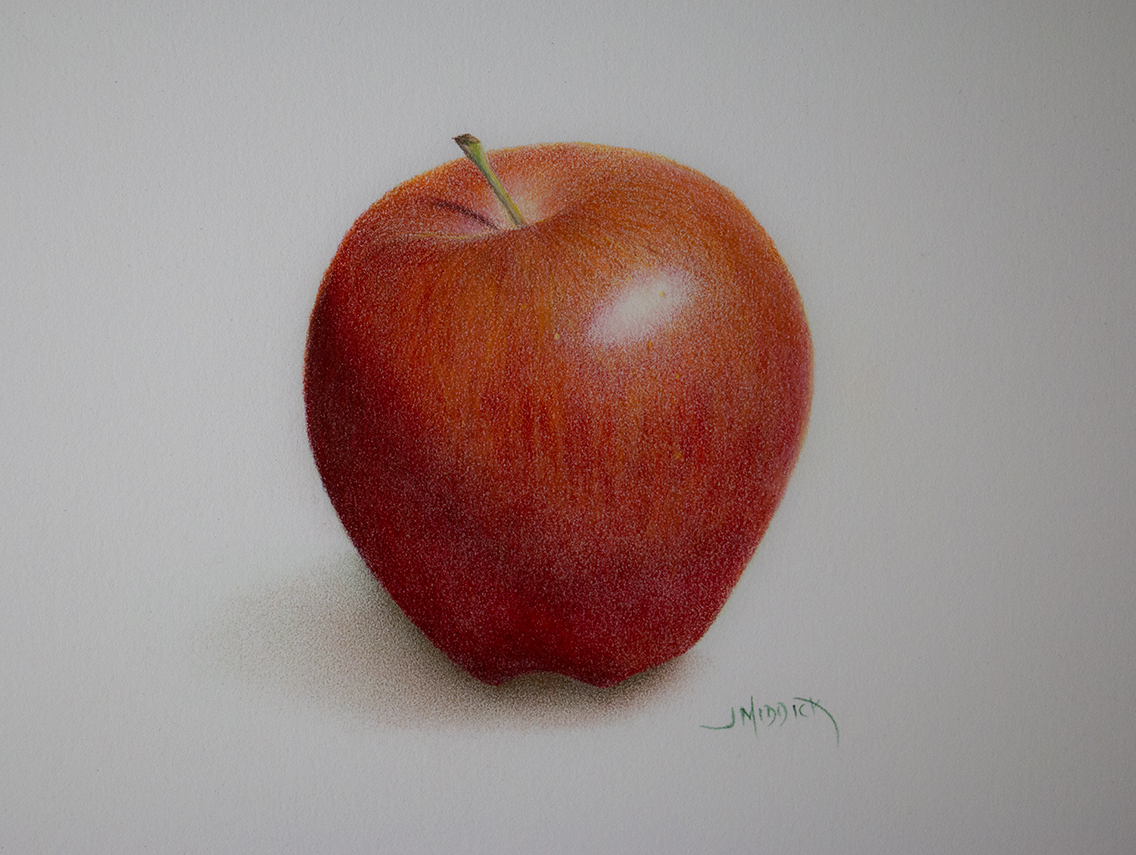
Red Apple Tutorial

View the youtube video here: https://youtu.be/JntcCBDzrQI

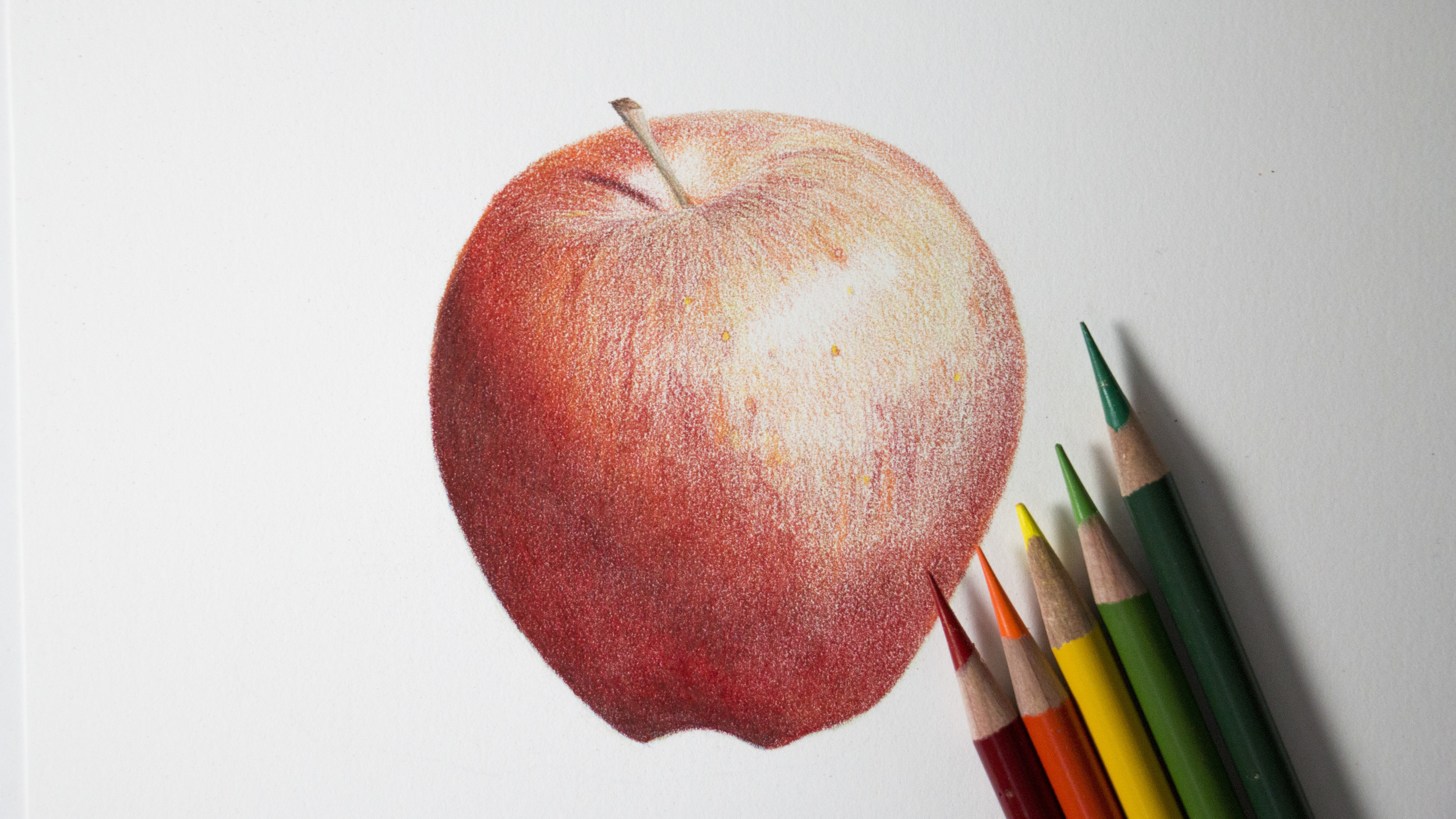
In this tutorial I walk you through creating a red apple from start to finish.  The reference photo (taken by me) is yours to do whatever you want with.

Be sure and download the apple reference.  Click the button above.

The individual colors used means so much less than the approach to the composition does.  Also outweighing color selection is how we handle form, value and application of the medium.

Creating art is problem solving and involves a lot of your senses.  Think about the dialogue in your head as you work through your own drawing.

Drawing is seeing and observing light, line and value.  Forget what you know and draw what you see instead.   Try to determine what direction the light is cast as you observe the angle of the subject.

Let’s get started!

Click here to download photos!

Step 1 - Line drawing.  I would use either a light green or orange with a very light touch.  The line drawing is one of the most important things about creating realism in a drawing or painting.  Pay close attention to the reference photo and the space and perspective.  It may be easier (especially if you’re a beginner) to trace the outside edge of the drawing to your paper.

Step 2 – Shading with green.  Why green?  Because the opposite color of red is green.  So in order to create the contour and form of the round shape with shadows I have to use the opposite color.  Most of the green will go in the shaded area of the apple, which is the bottom left side.

Step 3 – Shading with yellow.  The brightest areas of the apple will be the little area where you see the light reflected.  Be sure and protect that area.  Surrounding that area will also be very bright and so I want to use yellow in these areas.  Pay special attention to the direction of your stroke as you lay down color.

Step 4 – Add more light green.  Go over the top of the existing green and then smooth out the transitions of the yellow to the green area.

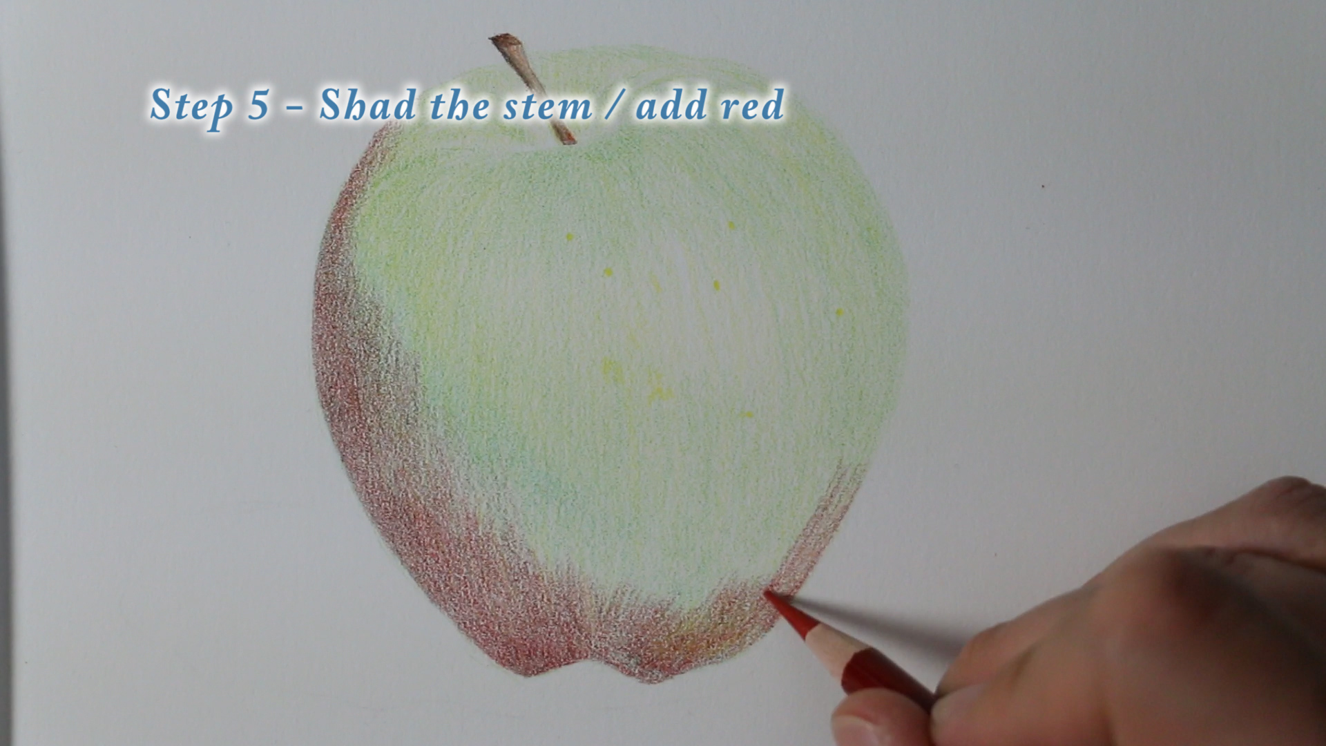
Step 5 - Color the stem and add red.  I chose to use more green in my shading of the stem in order to give my drawing more life.  Think about contour even in the stem.  The stem is mostly a cylinder.  Then with light to medium pressure begin adding a layer of red to the apple.

Step 6 – Shade with orange.  Start shading with orange over the most of the area of the bright part of the apple remembering to preserve the lightest area where the highlight will go.  

Step 7 – Add more red.  This time with medium pressure add more red. 

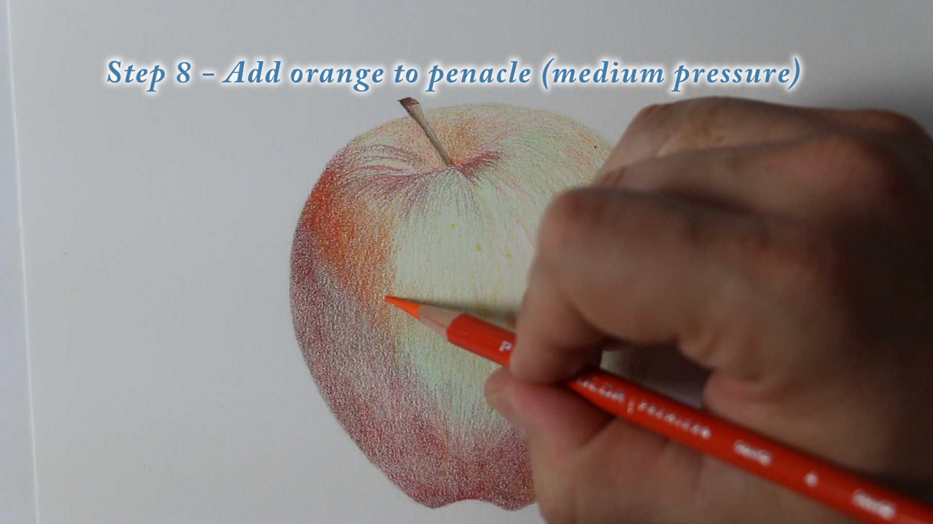
Step 8 – Add orange to middle of apple.  Add a strong tapered layer of Orange from dark to light across the pinnacle of the apple.  This is that area right where the largest girth of the body of the apple is.  Right underneath this area is where the shadow of the apple will begin.  

Step 9 – Add orange.  Cover the entire apple with orange.  But with only light pressure in the shadow area. 

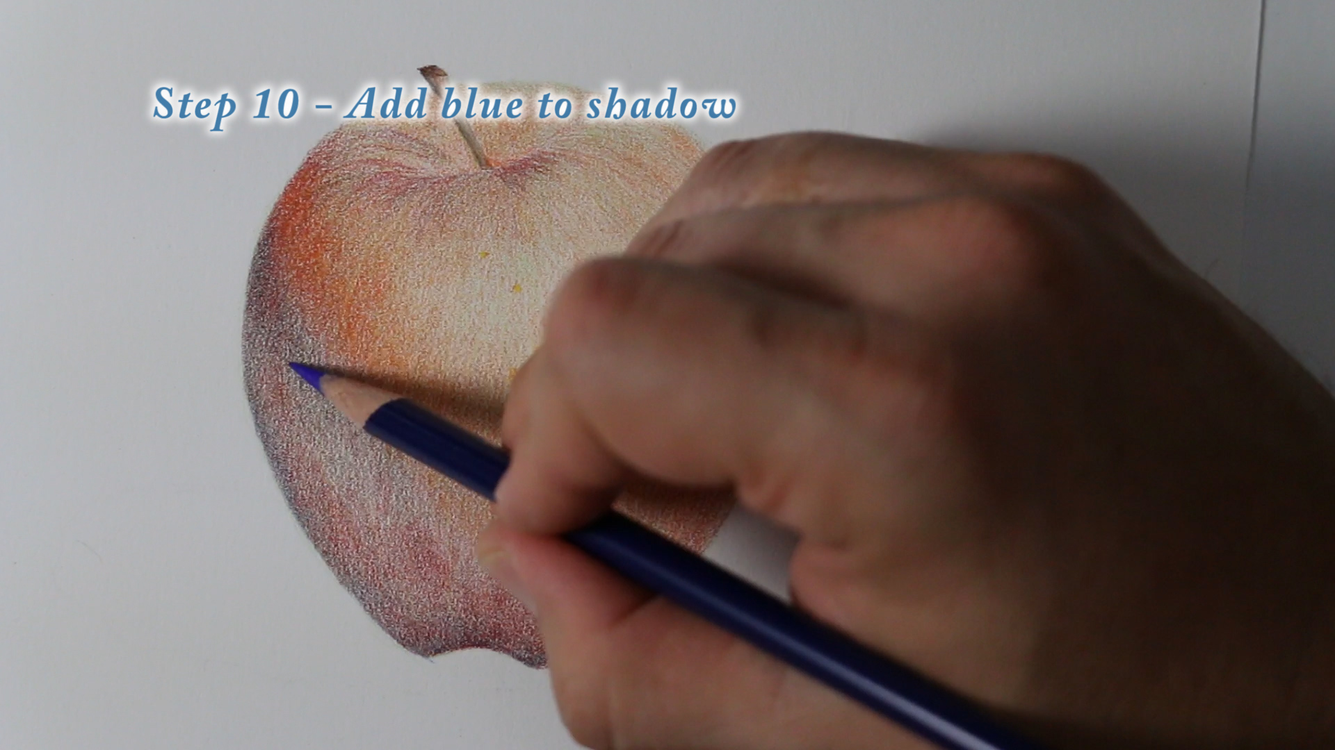
Step 10 – Add blue to shadow.  You want to add blue to the area that is nearest to the bright area first and make that your strongest dark value.  

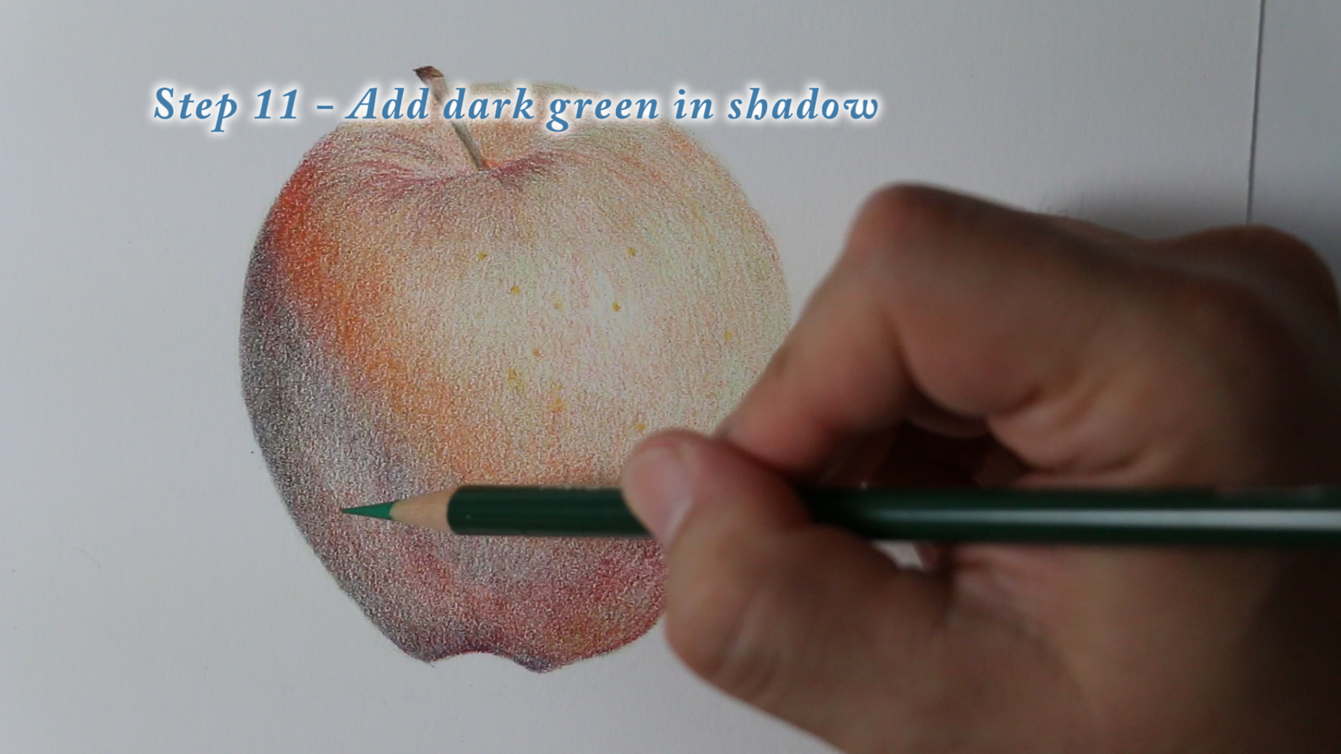
Step 11 – Add dark green to shadow.  Add the green to the shadow area and use light to medium pressure.

Step 12 – Burnish with red.  Burnish, very simply, means to use heavy pressure.  With a very sharp point and heavy pressure you will be able to fill in all the white of the paper.  This final burnishing technique adds a glossy look to the skin of the apple. 

Step 13 – Add white.  Add white to the small highlight area.

Step 14 – Add green to cast shadow.  You want to be very careful not to press to hard in this area.  It also helps to squint your eyes in order to detect how the value is being applied.  You want a slow, tapered gradation in value so that the shadow fades away in a very elegant way.

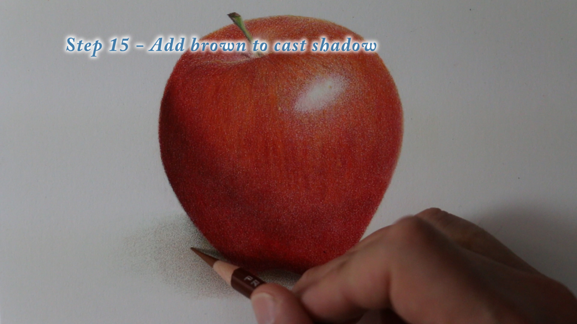
Step 15 – Add brown to cast shadow.  Add your brown color to the are closest to the base of the apple to show the increase in value closest to your object.  


Spray with a fixative and you've completed your drawing!   


Stay sharp!