10 Creative Ideas For New Direction In The New Year
Happy New Year!
It's a brand new year filled with new possibilities for your art.
I wanted to share a few words of encouragement as we head into this new year.
What Can You Do This Year?
If you're as enthused about the possibilities of this fresh year as I am, then I have a proposition for you...
Do something to stretch yourself in some new way.
Need some help?
Here are a few things to consider to get you started:
If you've been putting off establishing a daily drawing practice, now might be the time. If that still sounds overwhelming, then just grab a very small sketchbook and draw for just 5 minutes every single day!
Have you been wanting to expand your mixed-media knowledge? Perhaps you're a little hesitant about combining mediums with colored pencil. Simply decide to try it this year and go ahead do it!
Why not make this the year to pursue your ambition of creating a cohesive body of work? To get started, set a goal for how many art pieces you want to complete by January 2023. Then figure out the drawing you'll do for the first month, first quarter, and so on. Don't over-complicate it.
Maybe It's time to go local and check out your area's art gallery. It's only a small step from viewing to asking the gallery whether your artwork may be exhibited.
Perhaps you've been wanting some accountability to staying on track with your continued learning and development. It's not a sign of weakness- It's a wise person that seeks counsel.
It's possible that it's time to write and submit an article for publication in a magazine or website. If that's you, then here's the plan: Make the job of the editor extremely easy. Don't be pushy. Just share the article idea with them first. If there's interest, then supply everything they ask for before the deadline you're given.
Maybe it's time for you to start filming your work for a YouTube channel, a course, or a live zoom workshop. If you've got a newish cell phone, that's enough to get started!
If you've been drawing the same thing for a while, maybe it's time to experiment. Perhaps it's time to try something new if you've been doing portraits of just infants. If you've mainly drawn still life subjects, consider experimenting with a landscape or two. There are limitless possibilities for what may be fresh for you.
Change the size of your drawings. If you've been drawing mostly a 8x10 scale, then consider drawing a 12x14 size. Or, if you've been drawing pieces that are longer than 30 inches, consider doing a 5x7 from time to time. You may be pleasantly startled by what opens up to you creatively by making this one change.
Maybe it's time to start a website for displaying your work or updating the one you already have. It's an excellent method to display your work and, if you've been looking for commissions, there is no better point of contact than this.
The point is, there are no bounds to what you can do this year with your art hobby or career.
All you need is some ambition and a willingness to push yourself a little bit further than you have before.
Just pick 1 or 2 items that you have agency over. I know you can do it!
One final thing..
I know it isn’t always easy to make changes, but it’s worth it in the end.
Going in a new (or even slightly new) direction can open up so many new options that you don't have until you make that change.
So, What changes do you want to set in motion in the year 2022 for your art?
What will you do to make those changes happen?
I'm eager to hear about your art plans - and even more excited to see how those ideas take shape!
Beginning with the Basics for Colored Pencil Portraits
Stop Beginning At The End!
Portraits are some of the most striking pieces in colored pencil. When done well, the realism is breathtaking!
I can’t count the number of times I’ve heard someone say, “Is that colored pencil? But the people look so real! I didn’t know colored pencil could do that.”
Many artists (myself included) see colored pencil portraits and feel inspired to draw one themselves. They race off to the bookstore or start searching YouTube for a great tutorial, then wonder why their portraits fall short.
Why don’t my colored pencil portraits look realistic? Where did I go wrong? Can I even learn how to do this? What am I missing?
That last question is the most important! Most portrait tutorials are missing some of the most fundamental information needed to draw a truly realistic portrait: anatomy of the skull and face, angle and positioning variations, ideal proportions, and more.
It took me an embarrassingly long time to figure this out for myself.
But once I headed back to the beginning and did some of the necessary pre-work, I became comfortable with portraiture and began loving the results. My portraits started to come alive the way I had always wanted plus I was way more confident throughout my drawing process. I actually enjoyed the process!
That’s what I want for YOU. And, yes, it IS possible for you!
Welcome to the Portrait Prep Drawing Series!
In this series of lessons, I want to lead you through the all-important fundamental information. If you’re anything like me, you might think you can skip all of this stuff.
How to draw a line?? Anatomy? Head construction? Sounds like a waste of time-- I’ll just study photography and find great reference photos instead.
Not so fast, my friend! Learn from my mistakes, and begin at the beginning.
To create an appealing house, it’s essential to first build the frame before putting up the walls, painting, and decorating, right? Portraits are no different. To create a realistic portrait, you have to understand the underlying structure of the head before rendering the skin and hair and other features.
Follow along through the next few posts as I share with you some of the information I wish I’d had when I started drawing portraits. By the time we’re through, I want you to be so familiar with every possibility (face positioning, angles, and foreshortening of the features) that when you finally pick up your colored pencil, you will be ready to paint that final layer on a well-constructed head.
This article is the introduction to the Portrait Prep Drawing Series! Here’s the link to the first installment in this drawing series!
Want an even deeper look at drawing portraits? Sign up for my FREE Portrait Prep Drawing Course!
Portrait Prep is a video course inside the Sharpened Artist Academy. Together we’ll walk through the core fundamentals of drawing incredible portraits.
Sound good? Click here to signup
What are your biggest challenges when drawing colored pencil portraits? Share in the comments below!
Portrait Prep Series: From Line to Basic Shapes
Welcome to the first official installment of the Portrait Prep Series! Today we’re going to talk about a few of the basic skills you’ll need before you ever start to tackle a face-- and I do mean basic!
We’re taking it all the way back to lines, shading/value, and basic shapes.
Grab a sketch pad and follow along!
Lines
A line is all about finality. It says “STOP! Don’t look any further. There's nothing to see past this edge.”
Lines can also convey body, fullness, or a dark color. Caricature artists do this all the time. Their dark lines indicate dark brown hair or black hair, and their light lines indicate blond hair.
Believe it or not, a straight line isn’t found in nature! It’s just a convention that we’ve created to convey something that is visually ambiguous to us. Separating one value from another is a way for us to make sense of the world, but it’s important to note that straight lines will not be used in realistic drawing. Your work will end up looking more like a cartoon.
Nevertheless, a line is what we use to create marks in drawing. I recommend using small, straight lines as your stroke rather than the ovals or circles or points or curves you may have seen. This stroke is far more versatile and provides quick even coverage.
(One caveat--If you’ve already been drawing for 5 years or more and you have good control over your instrument, then stick with whatever stroke you prefer.)
Shading and Value
Portrait Prep Course students, refer to the video inside the course.
If you’d like to sign up for the FREE Portrait Prep Course, go here. The course begins June 1, 2020!
Shading is really a study of shadow and light. If there is light, then shadows are certainly present. In its simplest form, a shadow is just the absence of light.
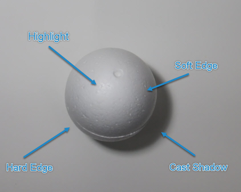
When it comes to shading and value, we’re primarily concerned with these 4 elements:
1. Hard Edge
2. Soft Edge
3. Cast Shadow
4. Highlight
When you begin to work on shading, you must ask yourself, “Is it a hard edge or is it a soft edge?” Next, think about what value on a scale of 1 to 10 that shadow is representing.
(We’ll break this down even more later, so don’t worry if it’s still a bit over your head.)
Let’s take a look at this styrofoam sphere as a visual example:
The sphere clearly shows us the separations of light and shadows.
Basic shapes
Today we’ll be looking at the elements of a basic square without shading it in. In later lessons, we’ll work on shading all the shapes (circle, square and triangles) and making them more 3 dimensional.
The most important concept here is learning to identify the length of your own mark by using your eyes.
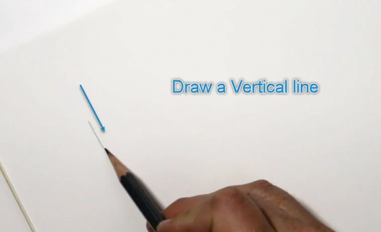
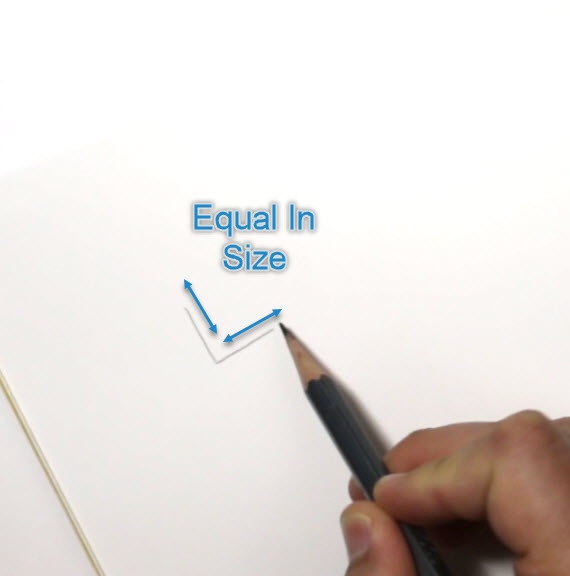
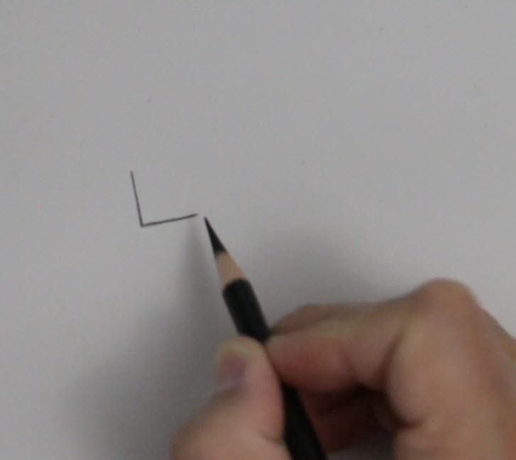
To do this, draw a vertical line.
Then draw a perpendicular line (equal in size to your first line) to form the first half of your square. DON'T MEASURE.
Check your work with a ruler. Were they actually the same size, or a little off?
Keep practicing this exercise until you can draw lines of equal size every time.
Creating a Value Scale
The next thing we’ll do is create a value scale.
On a value scale from 1 to 10, the values will span from a light area (ranging from 1 to 6), then a darker, shadow area (ranging from 6 to 10).
(Keep in mind that this exercise is intended to help you identify a range of values side by side. The likelihood of needing to create a perfectly-balanced, “1 through 6” kind of value in an actual drawing is next to none.)
Now it’s your turn to give it a try. Here are the exercises for this lesson:
Shading:
Practice fading the pencil from dark to light, then light to dark.
Create a Value Scale 1 to 6, then a Value Scale 1 to 10.
Practice over and over again.
Squares:
Draw a line vertically, then draw the line horizontally.
Create a completely separate image that is the same shape, but is half the size.
Repeat the process, this time starting with the smaller shape and moving to the larger shape.
Get comfortable drawing different types of boxes: squares and rectangles of varying sizes. (The 3-dimensional rendering will come later)
Congrats! You’ve made it through Lesson 1! We’ll be diving into contoured lines and more basic shapes in the next lesson- Lesson 1.2 it’s a continuation of what we started here!
Tell us about your progress in the comments!
Portrait Prep Series: Beyond Basic Shapes
Welcome to the final portion of Lesson 1!
Lesson 1.2
In our last lesson we talked about drawing edges instead of lines and the importance of training our eye to see relative size and proportions. We also touched on value scales and spoke about how to look at a sphere. If you missed it or need a refresher, click here to review.
If you’re ready to join the Portrait Prep Course go here now! We’re starting the course June 1, 2020.
This time we’ll begin by creating a few more shapes: first a triangle and a circle, then a cylinder to begin to see more depth.
We’ll use what we learned about a value scale to shade these objects and turn them into three-dimensional objects that can represent something in real life.
Triangles
Let’s start today with a triangle:
Draw your first vertical line….
...and then your horizontal line.
Be sure that your second line (which should be horizontal) is the same exact length as the vertical line. These equal lines should form a 90° angle.
You should be able to identify where the diagonal line ought to go.
You'll also start to notice the degree for the diagonal line. If your vertical and horizontal lines are 90° then your diagonal line should be around 45°.
If, however, the horizontal line is only half the width of your vertical line then your diagonal line will form a 30° angle. (See the examples below for a visual representation of what I mean.)
Create your own triangles and identify how the lines are related to one another!
Note: How does this relate to portraiture? Good question! Consider the diagram below. I've drawn the lines for the mask of the face, the curvature of the head, and the outlines we would use to develop the entire head. See the triangle? What we're doing with this exercise is learning how to think about our subject matter in a very three-dimensional way.
The line is from above the brow ridge to the ear hole (the external auditory meatus) next to the mastoid process.
Circles
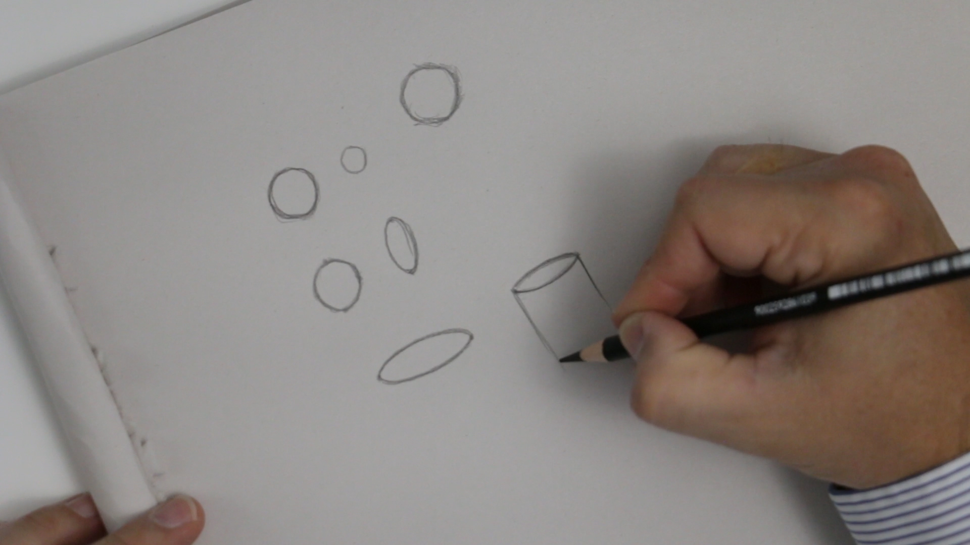
Now let’s move on to a circle. Drawing a circle is actually not quite as difficult as you may think. If you think about having four equal sides and then curve lines in between these points you should be able to draw a circle that is adequate enough to represent something that is circular in your portrait drawings.
Look at my diagram below and see if you can draw your own circle using the same method.
Create four dots evenly spaced apart, then add curved lines to complete the circle.
Note: We will never escape the need to identify shapes in drawing portraits or anything that we draw. Seeing the shapes and being able to recognize the relationships between one edge and another edge, or from one object to another, is an integral part of being able to draw proportions correctly.
Cylinders
Finally, let’s add more visual interest by creating a cylinder.
Step 1
Create an ellipse: Draw two target dots the width you want the cylinder to be, then draw a curved line between them.
Then repeat in the opposite direction to create a mirror image of the first curve.
Step 3
Create the final curved line at the bottom. You should notice that it's parallel to the lower half of your ellipse at the top.
Step 4 - Optional Shading
You could shade in the cylinder at this point, but this is optional. The most important part of this exercise is to be able to see all of these lines in relationship to the whole object, and to create the curved lines to appear realistic and three dimensional.
Shading a Circle into a Sphere
Remember the discussion of light and shading with the Styrofoam ball in the last part of Lesson 1? We’re going to use those same concepts when we talk about shading a circle into a sphere. Don’t forget: we'll have a hard edge, a soft edge, a cast shadow, and a highlight.
Step 1
Loosely sketch a circle.
Create an imperfect circle to fill in with value. Don't worry that the circle may not represent a flawless ball shape--you can refine the edges of the circle to make it appear more round as you go.
Step 2
Keep adding value very lightly so that you ensure everything is in balance. As you progress, refine the shape of the circle to be more complete. You CAN do this!
Step 3
Determine the light source and begin diagramming.
Diagramming is simply a fancy term for labeling the elements of a drawing so you can think about the names of those elements in the drawing process. This is a fantastic way to learn the subtleties involved! Your mind will begin to identify these things as being different from the other elements in your drawing.
Follow this checklist to diagram your sphere:
Draw a light source icon
Label the highlight
Label the soft edge
Label the hard edge
Label the reflected light
Label the cast shadow
Step 4
The last elements to label are the values from the value scale that you created. This is a highly effective way to determine if you’ve created a full range of values with very soft transitions. You don’t want a hard edge where it doesn’t belong--like in the middle of the sphere!
Simply draw lines and label 1 through 10. (I’ve grouped some of my numbers together to make it simpler, for example a 5 and 6 together and a 3 and 4 together.) The point is to create a sphere that makes sense--NOT to make the most beautiful-looking sphere anyone has ever seen! (It’s an exercise, not a work of art.)
We’re getting so close to our skull lesson where much of this will all be coming together!
Any questions about these exercises? Ask in the comment section!
PORTRAIT PREP SERIES: Lesson 2 The Skull, Muscle and Skin
Welcome back to Portrait Prep! (If you missed the previous lessons, you can find them here: Intro, Lesson 1, Lesson 1.2).
In this section, we're going to talk about the skull, the facial muscles, and the skin. These parts work together to form what we see as a complete face, so it’s important to get to know what’s going on under the surface to know how each part affects what we see.
The Skull
If you're using graphite and you're new to drawing the skull, remember to be patient with yourself and take it slow. Think more about the proportions of each of the areas you're drawing.
I typically start any drawing in the top left corner, move downward through the drawing, and end at the bottom of my subject and over to the right. I'm right-handed and I don't want to impair my ability to see what I've already drawn or smudge anything, so this method is effective for me.
To begin, draw a curve on the top right side to represent the major side plane of the skull in the cranium area. Next, make the same identical mark on the left side.
Once you have those two marks down pretty accurately, connect them at the top by another curved line which will serve as the top of the head.
The rest of the skull should be proportionate to the top part of the head. Ultimately there is no right or wrong way to draw the skull, but everything needs to be relative in proportion to what you've drawn prior to your current marks. If you find that your proportions are becoming out of scale to the rest of the drawing, simply erase and start that portion over. (I’d like you to attempt to draw it just by eyeballing the proportions for now. In a later lesson, we will go over the measurements of the skull to make it even more proportionate.)
Pay careful attention to the zygomatic area in the frontal view and make sure that you don't overemphasize it. You might be tempted to make it stick out further than it already does, so be careful!
Another cautionary area when drawing the skull is making the orbitals too circular and too close together.
You may also discover that you have a tendency to elongate the face area and make it seem much more vertical than it really is.
But remember: this part of the course is intended to be a series of exercises. You’re not creating fine art renderings to be entered into a contest or gallery. This is simply sketching with a goal of improvement and training your eyes to recognize accuracy.
Check out the reference that I've provided here as a guide for creating your skull drawing.
You can also look at the quick sketch that I've done in the picture below.
It doesn't need to be elaborate at this point. Just have a basic understanding of where these anatomical landmarks are.
(Portrait Prep Course students - you’ll refer to the "Drawing the Skull" video that was emailed to you.)
Muscles of the Face and Head
Now that we have a bit more background about the skull, let's move on to the muscles of the face and head.
If you're overly ambitious and have a lot of time on your hands, this would be an excellent time to learn all the muscles names that make up the face and head. If you’re like me and don’t have that much time to invest, don’t sweat it. All you really need is an understanding of where they are and how they relate to one another.
There are a couple of areas that have some interesting formations in the face that you will want to notice, outlined in the pictures below. There are some rounded muscles in the eyes, for example. The mouth areas also have some curved types of muscles that affect the way the skin appears in the nose and in the forehead. And then there are some muscles that overlap each other and come together in separate places of the face: the corners of the mouth and some areas in the neck.
Use the reference below to create a line drawing of the muscles of the head. This will help you gain a better grasp of where these muscles are and how they're positioned in the face.
Original image can be found at: https://en.wikipedia.org/wiki/Facial_muscles
Skin
The last part of this section is a very brief look at the outer layer of the skin. That layer is affected by certain landmark areas in relationship to the skull and muscles underneath.
Some of the most important areas to study skin positioning are the eyes, the mouth, and the nose.
The eyes:
The eyeball itself is positioned higher up inside the eye socket. The eyelid actually closes over the upper part of the eye where the top lid will meet the lower lid and produce most of the movement. This is the reason why there are often shadows on the lower portion of the eyeball (the sclera).
The mouth:
The mouth is more of a cylinder shape and is heavily influenced by the muscles that surround it immediately under the surface. The muscles get their overall contour from the skull (particularly the teeth, maxilla, and glabella).
The nose:
The nose has a curved area that covers the cartilage. While the length and side planes of the nose may not seem all that difficult to draw, the underlying structure and make-up of its anatomy is anything but simple.
In conclusion, I hope that this lesson has helped you become more aware of the underlying anatomy of the head and face. When we start to draw a more serious rendering with colored pencil (or another medium of your choice), this knowledge should come back to you and inform your decisions.
We want the knowledge to be sub-conscious and automatic so that we don’t have to think about it when we draw. We are working towards understanding WHAT we draw so that we can draw what we know. So we're trying to get past drawing what we see.
Have a question or discussion point about this info? Sound off in the comments!
Portrait Prep Series: Lesson 3, Planes and Head Construction
Lesson 3 - Planes and Head Construction
In lesson three of the portrait prep series, I'm going to give an overview of Planes and Head Construction. We’ll be using the Asaro head, the Reilly method, and the Loomis method. (No clue what that means? No problem! I’ll explain in a second.)
Head construction is so important because it in involves the entire head -- not just an isolated look at the face, or the sides of the face, or just features. It provides you with a framework which you can build upon. This as the final puzzle piece that enables you to begin your journey in drawing portraits!
The Asaro Head
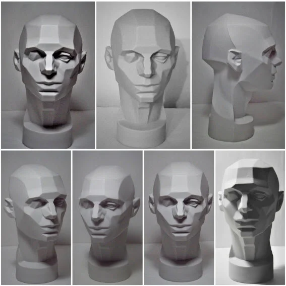
The first method to discuss is the Asaro head. I know of no better way to understand the shading of the head than this model. This is a 3-D model of the head created by John Asaro and helps our overall understanding of how light is reflected on the surfaces of the head.
When we study portraiture, we are learning the exaggerated planes and angles of an object that we often think of as round or spherical. Together we can practice looking at the model head (even if we’re just using a reference photo of the head) and draw it from our point of view.
Asaro Head Exercise
Study the images in the graphic below and notice how the light in reflected on each plane of the head.
Key things to look for in this challenge:
1. How many light sources are there?
2. Where is the light source?
3. Can you determine (and label) the value of each plane from 1 to 10?
4. How many planes are represented within each feature?
Head Construction Methods
There are two methods that are most popular for constructing the head: the Loomis method, and the Reilly abstraction method.
Someone may ask the question: Why should I learn methods for how to construct the head? Can’t I just copy from a photo instead?
Head drawing methods are giving you two essential benefits a photo can never provide:
1. The relationship of the features. (All the features are interconnected and have a relationship to each other.)
2. A way to label what you see. We're talking about a vocabulary and a language for something otherwise undefined. If something is undefined, then it’s abstract and can remain elusive. As realists, we can’t draw something we can’t see or define.
The best ways to learn head construction is to keep practicing it. Practice the things you learn often and keep pushing yourself and you WILL see results.
So with that backdrop, let's dig in!
Practicing the Loomis Method
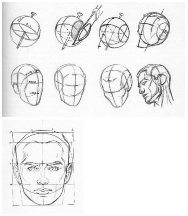
The Loomis method is explained in detail in Andrew Loomis’s book, “Drawing The Head and the Hands”. It’s a free ebook and can be found on google easily (you can go here: Loomis Book). Refer to the images below the steps from the Loomis book.
These are the basic steps that we want to keep in mind for our purposes in portraiture:
Draw a round ball.
Draw a vertical middle line (middle of the nose).
Draw a horizontal middle line (middle of the brow).
With an imaginary knife cut off the sides of each of the ball to represent the side plane of the head. (The top part of the circle is 2/3 of the height from the middle of the circle. This is also where the hairline should be. The bottom part of the circle represents the bottom of the ear and is the same plane for the bottom of the nose.) You will also have to determine where the circle curves at the side plane of the face.
Determine the angle of the side plane by making the line from the ear to the brow.
Then extend the line to the front plane.
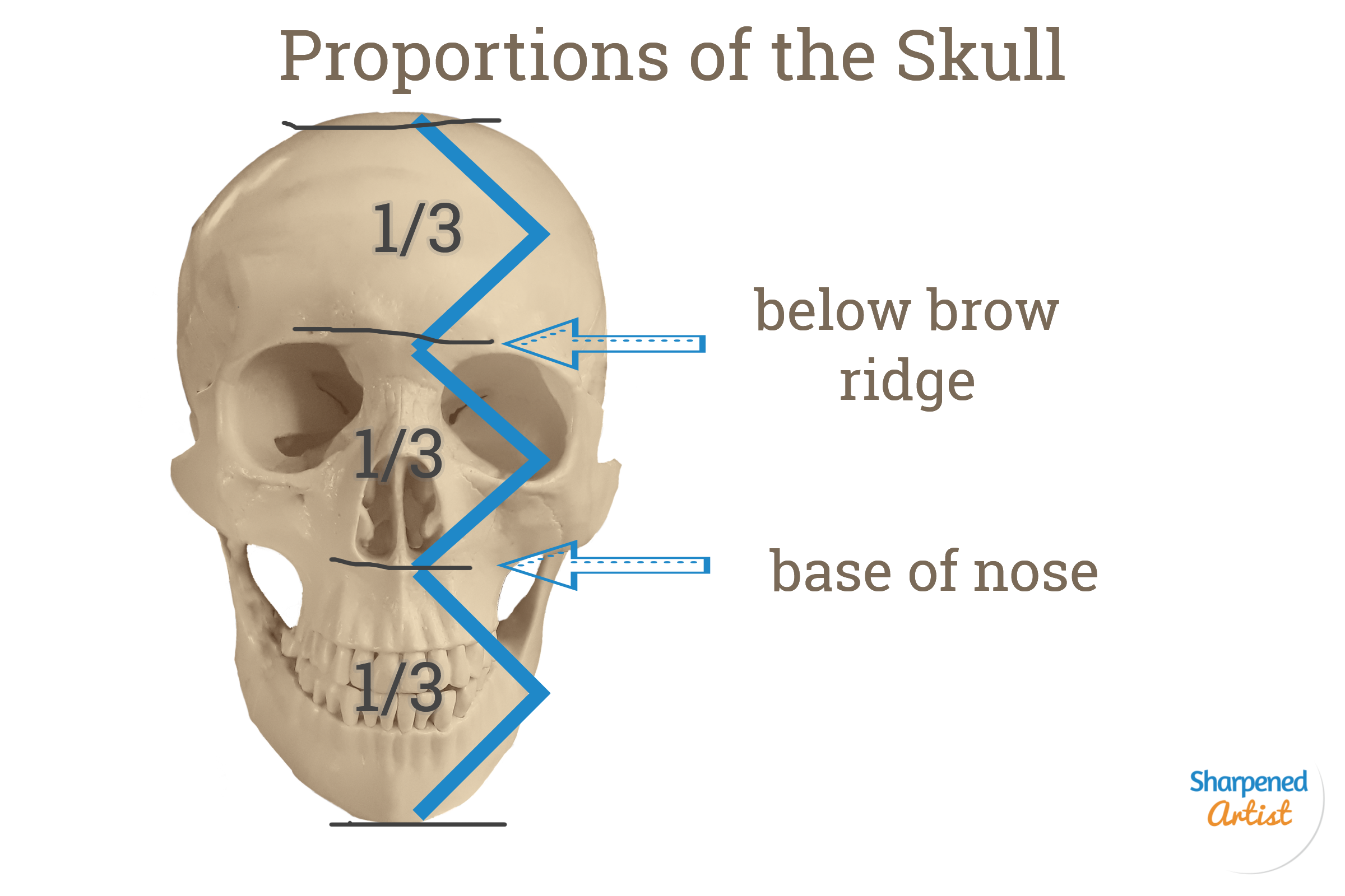
Then render the lower and upper lines parallel to the middle line. This will give you the thirds of the face: hairline to brow line, brow line to base of the nose, base of the nose to bottom of the chin.
So next draw the bottom of the chin line. Extend the line (create a box like shape) and draw the jawline.
Find the eyes by placing your mark half way between the top of the head and the bottom of the chin.
The bottom of the bottom lip is halfway between the base of the nose and the bottom of the chin.
The Reilly Head Abstraction
Nothing is written down from Frank Reilly. We have very few writings from his students. I think that there are things we can learn from the Riley method. But mostly we're relying on what his students wrote about this method and what these students and then students of the students were able to communicate about the method.
One thing the Riley method incorporates well is a rhythmical relationship of the features in the head and face. So every feature has a relationship with the rest of the features. You could almost use one continuous line without Ever Lifting your pencil from the paper to create all of the rhythms in the face.
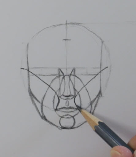
So really the best way to explain this particular method is to show you in a video I've prepared and you can look at the reference that I'm picturing here below.
For those that sign up for the Portrait Prep Drawing Course, You’ll have access to the video lessons. If you’d like to sign up for the course, go here to sign up! We’re starting the course on June 1, 2020.
To begin the Riley method you need to have the outline of the head complete. So it doesn't really matter what method you use to create the head you just need to have the top of the head bottom of the chin in order to fill in the Reilly abstraction Rhythm lines.
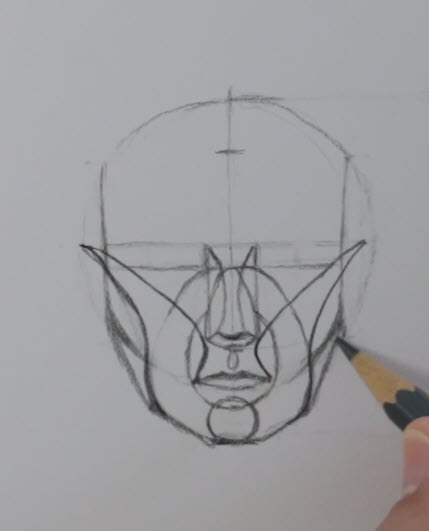
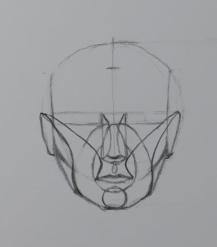
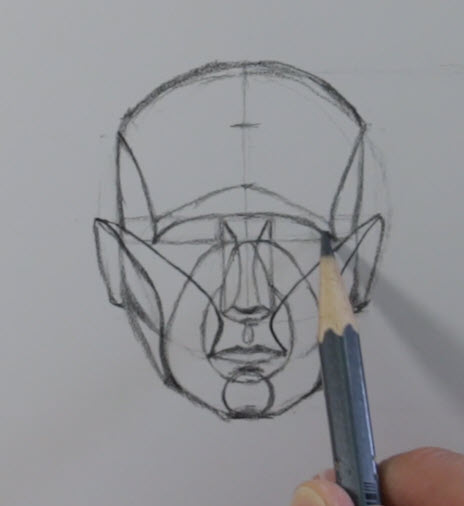
1. Start with creating a round circle with the vertical and horizontal line in the frontal view.
2. Next move down one-third of the way from the middle of the circle that you created to create the bottom of the chin. This establishes the 3 divisions of the head.
3. Once you have the head outlined and know where the eyes are in relation to the brow line, you can move to the nose.
4. The nose is the width of the eyes.
5. Make the upper line to establish the ball of the nose.
6. Make the line where the keystone is, then add the curved line on each side to connect the keystone to the ball of the nose.
7. Add 2 curved lines from the keystone, to the base of the nose.
8. Create the muzzle of the mouth line by starting at where the intersection of the side plane crosses the vertical lines that were extended from the corners of the eyes.
9. Create the band of the face, or laugh line area, by starting at the keystone again and completing that curve with the jaw line.
10. The chin line extends from the bottom of the chin and intersects with the muzzle.
11. The mouth is identified by the intersection that just happened with the chin and muzzle.
12. Establish the cheek bone area (which should already be showing from our circle earlier).
13. Draw the rhythm line from corner of the mouth, pass by the corner of the nose to the side plane of the head where the brow ridge is. This is the helps establish the upper cheek area.
14. Start from the top of that rhythm that you just created and fill in the underside of the cheek.
15. Next, connect the ears from the cheek line that you just created to the base of the nose plane.
16. Draw the side plane of the face on the forehead using the placement of outer area for the eyes and cheek as a guide for connecting this line.
17. Now you can add the curved brow line.
18. And finally, the eye curved line.
19. You could also add the eye placement as more detail.
Bonus: The John Middick Method
Okay, okay, so I’m not presumptuous enough to think that anyone is going to name an entire method after me. But I do think it’s beneficial to share some of the steps I take when doing my own head constructions!
I like to always consider where the head tilt is with each portrait I do. To do this, I think of 3 axes for the direction and location of the head in space:
1. The x-axes is measured by a line across the pupils. If the line isn’t level then the head is tilted. This is a better measurement than slant of eyes or eyelids.
2. The centerline down the nose, mouth, and chin. If this line is not perfectly centered in that y axis area then the head is angled or rotated to the right or left. Questions to ask: Do I see more of one nostril than the other? More of one ear? Is one of the corners of the eye behind the nose?
3. The position of the chin. Where is your eye level position: up or down? Is the bottom plane of the jaw seen? Do I see the underside of the plane of the nose or the hairline? These are all clues about the head rotation.
If you can answer these questions then you can begin to understand the tilt of your portrait subject better. You’ll know how to think about the subject more in a 3 dimensional way.
Remember: Don't overcomplicate it! Just do the construction very simply in the way that feels most comfortable to you. As you progress in your sketching with practice, you'll add more and more detail. The bottom line is to always keep practicing and practicing and practicing.
And there you have it! You’ve completed the Portrait Prep series. This is just the tip of the iceberg when it comes to portraiture, but mastering the skills discussed in these blog posts will give you the foundation you need to start drawing the realistic portraits you’ve always hoped for.
Is Talent Holding You Back?
Have you ever been told you have a “natural talent” for art? I get it-- I’ve been told that, too.
You’ve probably thought it was a benefit….but natural talent can also be one of the largest obstacles to improvement.
The “talent myth” can make you feel like you can sit back and not worry about improving, thinking you will just naturally get better.
You might think, I’ve never really learned what I’m doing now and it seems to be working. So you reject learning anything new that may offer some artistic insight.
Some artists are even afraid of demystifying the process. They’re worried that they may not be able to intuitively engage in their craft anymore--and that’s definitely a scary thought!
Sometimes you have to “unlearn” before you can improve!
Believe it or not, there is a methodical approach to what you’re doing when you draw or paint. If you’re open to discovering it, it can help you blow past your current limitations. Talent can only get you so far.
So what kind of improvement can you expect when you break down the process? You will:
- Develop more control of your craft when you know how it all works.
- Know how to make any necessary corrections.
- Learn how to approach a drawing in the same way every time.
- Know why you tackle the hair first (or last) on a portrait.
- Learn to focus on shadows first and increase their value slowly as you build up the drawing.
…..and that’s just the beginning!
You can learn the building blocks that will take it to the next level-- and the first way to begin this process is to not let talent hold you back.
You want to level up your art--and that means you and I are a lot alike! Tune in next time where I’ll keep sharing what I’ve learned on my journey.
Are You Drawing Backgrounds That Don’t Work?
Let’s have a little chat about backgrounds, shall we?
Most new artists feel the need to have a background in their drawing. That’s all well and good.
An effective background can:
Add depth and interest to your subject.
Create context and keep the viewer engaged longer.
Help establish the focal point and allow the subject to stand out.
But an ineffective background can actually compete with your subject for attention. (Not good.)
Let me use a few photographs to explain what I mean.
When you look at this photo of a little girl, your gaze is automatically to her eyes-- that’s the focal point. The dark irises are starkly contrasted to the white of the eyes (sclera).
What do you notice about the background?
It’s just a few blurry shadows and barely there at all. In fact, you probably didn’t notice it until I asked about it. That’s the sign of a background done right.
Can you imagine what would happen to the impact of this photo if it had one of those “use all the circles” backgrounds I’ve been seeing lately?
Let me show you:
(You’ll have to pardon my quick photo edit, but I think you get the idea.)
Now instead of a realistic portrait, we have some sort of new-age space photo. The circles are incredibly distracting and the eyes no longer have our full attention. Why? Because the background has just as much contrast as the eyes do.
The entire tone of the portrait has been altered--and not for the better.
Here’s another photo example with an ineffective background:
Notice that the level of detail in the background is similar to the level of detail in the subject. The colors are similar across the board, too.
We see similar values in the skin, hair, and face of the subject as we do in the background of the rock, stairs, and leaves. The reason this doesn't work is because our eyes are naturally going to focus where there is more contrast. The brightest, or lightest value, of this picture is the dress. So our eyes are immediately drawn there. It does nothing for the overall balance and composition and the focal point is uncertain.
A simpler background with less contrast would have created more focus on the portrait itself. I've done this in the edit below.
The same problem is happening in this photo:
The background in this shot is WAY too distracting.
Now that you’ve seen how this works in photography, you can apply the same concepts to your art.
My recommendation?
Don’t force the background.
If you can include a background that makes sense for your piece--one that is NOT distracting-- then go for it! Otherwise, just leave it out. Let the subject be the focal point no matter what!
***NOTE: All photos in this post are free to use commercially or personally without attribution.
You Actually CAN Erase In Colored Pencil
When I first started drawing, I was like most beginner artists and used only graphite and charcoal. When I discovered colored pencils, it felt like everything clicked. Suddenly, my drawings had the potential for greater versatility and depth. I'd hit the jackpot!
All those feelings of excitement quickly drained away the first time I tried (and failed) to erase the way I had been used to. Was it possible that colored pencil wasn't the versatile medium I had hoped it would be? Was my art career over before it even started? Would I be better off giving up entirely?
Obviously, I needed a little pep talk and some research.
In time, I learned several erasing methods that give me more freedom and options. Thank goodness I didn't call it quits, because you CAN erase colored pencil--and it isn't even difficult!
To keep you from despairing like me, I've put together this little tutorial to show you some steps to keep unwanted marks off the paper:
Method number 1--Use a Light Hand
Using a light hand (also called light pressure) when applying the pencil is the first method I recommend. To do this, hold the pencil comfortably in the tripod position. Keep your grip loose enough for the pencil to graze the surface of the paper using its own weight alone. Holding the pencil further down the shaft (opposite the point) will help you do this. If you use a soft touch and you’re careful not to burnish your paper too early, then you can erase marks if you need to.
Why it’s important:
Keeping a light hand not only helps with getting tons of layers down but it also helps you to erase the pigment if you need to. If you press very hard and grind the pigment down into the paper, it simply cannot be removed. Are you a burnisher? No problem. Go ahead and burnish, but wait to do it until the very end when there is nothing more to do on the drawing.
Method number 2--Work in layers
Build up the layer 1 to 2 colors at a time all over the areas in your drawing. Only after you’ve done one layer of color everywhere will you move to the next color. Repeat the process of building up the next layer slowly and gradually, and keep the point of your pencil sharp the entire time. Keep a test sheet of paper next to your drawing and take notes on order in which you laid down the pencil colors.
Why it’s important:
When you remove or erase areas of pigment in a certain area, you'll need to build the pigment back up in that small area using the same process as the section surrounding it. Without detailed notes about the colors you used and the order you layered them, you may find yourself constantly building up color in a fruitless effort to remember how you achieved your original look.
Method number 3--Erasing with Tap-Lift-Scrub
Like a boxer in the ring using 3 types of blows against his opponent, you also have to go at this removal process in these 3 creative ways.
First, tap with a kneaded eraser or poster tack. If you’ve followed the first 2 methods then your pigment will be easy to erase! The idea of tapping is to gently touch the paper with the sticky adhesive of the kneaded eraser and allow the pigment to be lifted from the surface. It seems to be more effective if you do this gently and keep moving your eraser to a clean area.
Keep in mind, there is a law of diminishing returns with this method. If you’ve done it a number of times and you notice that there isn’t anymore pigment coming off, then it is time to move on to part 2 of this erasing method. In the lift approach, you can take Scotch tape and apply a small bit to the area. Press it down gently with the tip of the pencil and then lift up on the tape and you’ll see more pigment magically disappearing. It's known as 'magic tape' for a reason!
Here’s a portrait I was working on recently where I used this very method to correct problems I had with the black pigment in the eyelashes. I followed these simple steps and I was back on track in no time.
If these first two methods don't work, go ahead and try the third choice as a last resort. This option involves using a synthetic eraser or plastic eraser to remove any last pieces of the pigment that have become a stubborn stain on the paper. There are also effective battery-operated erasers that make this process even faster and offer a lot of control.
So there you have it-- three ways to use whatever drawing techniques you like while enjoying the freedom to erase. What more could an artist ask for?
Behind the Scenes: 12 Things You May Not Know About Me
I'm a big fan of the Internet.
One of my favorite parts of running an online business is the opportunity to get to know people from all walks of life. I'm always intrigued by the variety of people who find Sharpened Artist.
It occurred to me that many of you might not know much about me, though--beyond the fact that I'm a colored pencil artist. So today I'm sharing a list of things you may not know about me:
I come from a large family. My parents had 10 children, and I was #8.
When I was 7 years old I was rushed to the ER after having my right hand caught in an air compressor. The doctor did a skin graft from my stomach to patch up part of my 3rd finger. You may see that scar from time to time in my videos. Now I can scratch my belly by just scratching my finger in that one spot. Ha!
I grew up way out in the country of rural southwest Oklahoma. My brothers and I hunted and fished a lot. When I was about 12 years old I took a correspondence course to learn taxidermy. I mounted birds and small animals. Believe it or not, it was an artistic outlet.
I'm a christian. I believe Jesus Christ is both Lord and Savior. There is nothing new under the sun. I don't believe something has value or merit just because it's faster, larger, or more recent.
I live in a suburb of Cincinnati, Ohio. I work from a home studio.
I worked in a systems/IT role for about 20 years at the same company. My commute to work was 40-60 minutes in the morning and around an hour and a half in the afternoon. Back then I listened to lots of podcasts to pass the time.
My grandmother Henri inspired me to be an artist. She always told me that I was going to be an artist when I grew up, and I believed her. I drew all the time as a child. I often got in trouble at school for drawing during class.
I have always been a music lover. I love to sing and I used to play guitar a little when I had more time for extra hobbies.
I’m very much at home in the kitchen. I love cooking, baking, using knives, and making things from scratch.
I have a cat in my home named Mascara. Yes, my daughters named her that. I love that cat!
My favorite hue is blue. I prefer the cooler blues, but any shade of that gorgeous color is great!
One of my favorite simple pleasures in life is coffee! I don’t care where I get it- Starbucks, the boutique coffee shop down the street, or my Keurig at home. All I need is a cup of joe, a laptop (if I’m working on my websites), or a Stonehenge drawing pad and a few pencils and I’m transported to a happy place.
There you have it--12 bits of trivia about me. Don't worry, there won't be a test. :)
Hollywood Gets Artists All Wrong
Have you ever seen a Hollywood depiction of an artist? The character is usually a moody, melodramatic loner who spends all their time shut away in a darkly lit room, pouring their genius onto the canvas as inspiration strikes.
Does that sound like you? No? Oh good, me neither.
Though it may seem glamorous to shut out the world and bask in the glow of your latest masterpiece, the truth is that most accomplished artists have a whole team of people contributing to their success.
Here are just a few people you'll want on your side:
1. Family and friends who understand the time it takes to create quality art and don't get upset when you have to decline social events to meet your deadlines.
2. Models who graciously pose for you until you get just the right reference shot.
3. Fellow artists who are on the same journey and just "get it" when many others don't understand your passion.
4. Local and online suppliers who keep you stocked with pencils, paper, erasers, and all of the other tools you need to carry out your work.
5. Technology experts and copywriters who give your website the professionalism it needs to attract paying customers.
6. Instructors and mentors who give you direction and help hone your skills as you grow. (That's me, and I couldn't be more honored!)
The stereotypical artist might prefer to go it alone, but you don't have to. Start building your team and reap the rewards of a valuable support system. It's one of the best decisions I ever made!
Do you have someone on your side that I didn't mention? Share your ideas in the comments!
Should I be entering art shows and competitions?
It's a question I am asked fairly often, and something that many new artists feel is a requirement to be considered authentic. Art shows and competitions are certainly not a requirement, but they can provide you with valuable experience. Here are my top three things to consider before entering your work in an art show or competition:
1. Do your research. Every competition is different, so the first step is to be familiar with the one you are entering. Due date, file specifications, and entry fee are all things to be aware of, but it can also be beneficial to do a little sleuthing about the judges. If you're into realism but these judges tend to prefer abstract pieces, for example, you may be better off entering elsewhere.
2. Consider your investment. Most art shows and competitions require you to pay an entry fee, which is typically used to pay for the building, insurance for the event, and that fabulous cash prize you are hoping to earn. It's important to decide ahead of time how much you can afford to spend on an entry fee. If art is not your full time job (raising my own hand here!) then you might not have a whole lot of extra cash sitting around to spend on entry fees. And if you still consider yourself a beginner, it may be a better use of those limited dollars to invest in some higher quality supplies.
3. Have realistic expectations. Most artists don't find competitions to be an instant jump forward in their careers, but they can be a great way to network, bolster your resume, and generally get your name out there. And most importantly, be sure that you are in it for the joy of the experience!
So there you have it--3 considerations for entering art competitions. What would you add to the list?
7 Steps to Take BEFORE Accepting Commissions
Accepting commissions may seem like a no-brainer. Getting paid to do what you love? Yes please! It's a wonderful way to build your portfolio and promote your business. But accepting a commission before you're ready can end up being detrimental. Here are the steps you should take BEFORE accepting a commission.
1. Have 10-15 pieces of that type (pet portrait, landscape, etc) under your belt. This will allow you to know your own timeline for completion, and patrons will be able to predict what a new piece will look like since you are already establishing your style.
2. Firmly set your pricing structure and make it available to potential clients. You may publish it on your website or have a document ready to send in response to an inquiry. Either way, stick to your guns on pricing! You don't want to gain the reputation of being someone who can be haggled with.
3. Decide how much you will require as a deposit--and yes, you need to take a deposit! This will deter clients who aren't serious about paying for the final product.
4. Agree on a detailed reference photo BEFORE signing a contract so that you have something you can work from. People look at your best work and expect that their commission will look the same. This won't happen if the reference photo is sub par. Until you have a clear photo in your hand, do not accept the work.
5. Develop a contract for services rendered. Be very clear about the scope of the work that you have agreed to do, and the financial responsibility of the patron.
6. Find out the patron's preference for social media sharing of their piece, both in-progress and at completion. If the piece is a gift, they may want you to wait. There also may be privacy concerns if the subject is a minor. Before accepting the commission, this is a conversation you need to have.
7. Have marketing materials ready to send with the finished piece. You'll want to have these ready before you start so you won't be scrambling to throw something together when you've completed the work. Consider a high-quality business card at the very least.
8. Don't be afraid to turn down a commission if something feels off. If you are not going to be a great fit for this patron, there are plenty of other artists out there who may. Don't feel obligated to accept just because someone asks. Value your own time and skill, and feel free to be selective.
By taking these steps before you ever accept a commission, you'll be ready to respond at the first request and communicate how professional you truly are!
What are your tips for successful commissions?
Is There A Right Way To Draw?
I can answer this question quite emphatically: No, there is not a “right” way to draw. But I think there are some more effective ways to draw and I think there are some less effective ways to draw. What do I mean by that? Allow me to explain.
If you think about the mechanics of drawing then you’re probably visualizing a writing instrument, a paper and maybe a reference or at least an idea that is being executed, right? Yep! Those are the base requirements to get started. But drawing is so much more than this.
I hear artists, especially young artists, talk about how they like to just draw from their memory. If you’re attempting to just get a quick sketch (concept) on paper then that’s a good way to do it. But if, on the other hand, you want to develop a drawing that is dynamic and full of life, then I suggest putting more planning and thought into it. Drawing from memory is not wrong, but it could be described as less effective.
Start with this checklist that you can walk through in your mind:
What are you wanting to convey? Try to be as detailed in your response as possible.
Do you have a reference for your drawing? If so, is it detailed enough for you to see what you need to see?
What tools in particular are you going to use? What about pencils, paper, size of paper and placement of the subject on the paper? Are you going to allow a lot of negative space around your drawing or are you filling the paper entirely? Are you going to draw a background or not?
Once that preliminary planning is done, there is a second part to getting started. At this point you could dive in and probably be fine. But ask yourself, is there anything about this process that involves something brand new? Maybe you’re using different pencils or paper that you’ve not drawn on before. If that’s the case then you will want to test on a separate page to determine what will happen so you can eliminate any surprises.
Now you are making your first marks on the page. You want to start with a light hand so that you can erase anything that you may want to alter later. This is the reason I always start with a dark pencil or at least a middle tone color so that I can see what I’m drawing and so that it can provide a skeletal framework for me to work inside of.
As I progress in the drawing process I am constantly refining my line drawing and I am erasing the line drawing where I may have made incorrect marks. Specifically, I’m looking for incorrect proportions in a face, I’m looking for a form shadow that is too overbearing, and I’m looking for something in my drawing that is starting to draw too much attention. When you’re just beginning you probably do not want to draw more than 15 or 20 minutes without taking a break. Why? Because you will grow mentally tired and may make a decision that is not in balance with the entire drawing and you may inadvertently create an eye-sore that you will have trouble removing later. But after a 5 or 10 minute break your perspective will be fresh and your vision will be clearer. Remember that drawing is more about seeing than it is drawing.
If you draw with a heavy hand at the beginning and you develop one area (like a neck for example in a portrait) and you’ve left the forehead alone, then you will need to remember exactly how you executed the neck. It is so much easier to go ahead and do the layers all at the same time. If you lay a base layer of “brown ochre” down in one area of your drawing, then just make sure you layer that color everywhere (of course the coverage will vary according to subject). Once that is done, then move on to the next layer.
What about the stroke?
The stroke that you use should be something where you are holding the pencil with a comfortable grip and with a motion that you can sustain for a long time without tiring. You can also use a variety of strokes, but they should always be controlled and not strained. The pencil should be able to rest comfortably in your hand to allow you to make the mark you intend to make. You never want a situation where you are wondering where the tip of the pencil is going to end up connecting with the paper.
Finally, once you make a mark please never think that you have to live with that mark. If you don’t like the mark you just made then erase it and do it again. You will get better at making marks and it will get easier to control. But don’t make the mistake of waiting until an hour goes by, thinking in your mind, I’ll just correct those mistakes later. Do it now. Take care of it while you remember what you need to correct.
Is this the only way to approach a drawing? Absolutely not. But this is what I have found to be more effective time and time again.
Stay Sharp!
Ready to get started using colored pencil? Download my getting started guide!
5 Reasons I Love Using Colored Pencils
The Power Of Middle Values In Portraiture
Middle Values Can Make Or Break Your Artwork
As an artist, I often get questions from people about their own drawings. One of the things I hear over and over again is, “How do I get my drawings to look more realistic?” This question is usually followed by an exasperated sigh, as if the budding artist is close to giving up.
This was an early shot of a commission (from a badly out-of-focus reference I might add) I was working on some time ago.
You can see that the face is all rendered in monochromatic values with no color applied yet. The only pencil color I'm using is Bark, Inktense, from Derwent.
Conventional wisdom would tell you not to create a line for something that should be represented as a curve or an edge, opting to use shading to represent everything instead (even where you think there is a line). This is very good instruction for achieving more realistic drawings, as it will call your attention to shape, size, proportion, and relationships to negative space. These are all good things to be aware of.
But I think the most realistic drawings come when an artist develops the ability to see value changes and differences in the middle values. The average joe can usually tell the difference between the darkest values and the brightest values, but to go beyond that and start to make judgments in the middle values will bring your drawing to a whole new level.
I know what you’re thinking—Sure, John, sounds great. But how in the world do I learn how to look at middle values? I’m so glad you asked!
One way to do this is to begin using a technique from the old masters called the grisaille (pronounced GRIZ-EYE) method. (This has nothing to do with a grizzly bear, or its eye… though that would make an interesting drawing.) In the grisaille method, you render your entire drawing by reducing down to values. For example, if I am drawing a colored pencil portrait then I will first draw the entire drawing using 1 or 2 pencils colors. I will only use light pressure in the lightest areas. I will cover the entire face with the pencil and will not go on to until I cover the entire face.
Think about the drawing process using these 3 steps:
Outline. Create a very soft (nearly invisible) outline of the proportions. The outline of the face, the edge of the hair line, the outline of the eyes, then nose and mouth.
Go Dark. Next, gently increase the value of all the areas where you see shadows. For example the corners of the mouth, the corners of the eye, the underside edge of the nose.
Make the Middle. Finally, with a very dark pencil and with the lightest touch you can possible make increase the value in areas that you consider the middle values. Here is where the magic will begin to happen. By “lightest touch possible” I mean that the only pressure you exert in nearly just the weight of the pencil itself and you are only controlling the direction of the tip! EXTREMELY light touch. Imagine that the paper is a pressurized bomb and if you press too hard it will blow up in your face. Ok, that was extreme. You get my point, right?
"What Is Your Favorite Paper?"
It's a question I get often
A colored pencil artist has many options when it comes to paper!
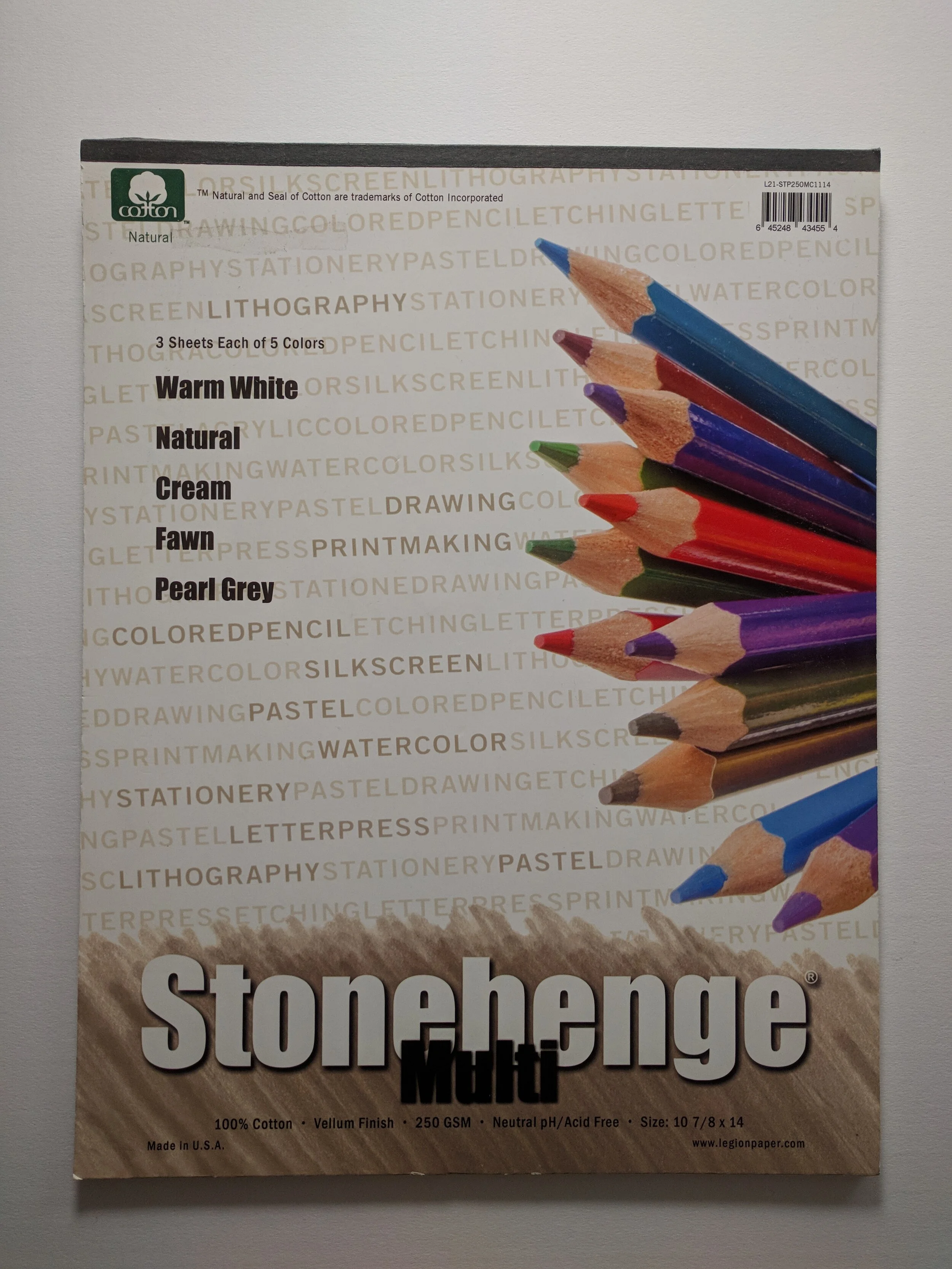
One of the things I like about using colored pencils is you can use so many different types of papers or supports. Anything from canvas, paper, glass, wood or stone or even some I haven’t thought of or heard of yet. I have used and tested several different papers and have settled on a few. But there is one that I tend to use more than any other. That paper is Stonehenge from Legion paper. Click here for my colored pencil supply list.
There’s a few other papers that I love for colored pencil. You can read about another of my favorites here. It’s called Pastelmat.
Here are the reasons I like Stonehenge
A LOT of Tooth! The tooth of the paper refers to the texture on the surface of the paper, sometimes called hills and valleys. In short, it’s the texture. The tooth of this paper has a random texture and is still smooth enough to get good detail without having to fill in a lot of layers to do it. But, if you want more layers it can take a lot of layers!
Material
This paper is made of 100% cotton and is acid-free. This means it will stand up to a lot of reworking and solvents and still maintain its original shape and not buckle as long as you tape it down flat. It will also last many years and is archival because there is no acid in the papermaking production.
Quality
So far the company has stood behind its product and has consistently produced a good product. It is always consistent in quality and you can rely on the paper from a new purchase is going to be just like the last time you bought it.
90 lb Weight
The thickness of the paper is 90 lbs. It is just about the right thickness. It is not so thick that you can’t print on it. It’s also not too thin that it seems flimsy.
What is YOUR favorite paper? I'd love to hear what you like! leave me a comment.
