


Let’s have a little chat about backgrounds, shall we?
Most new artists feel the need to have a background in their drawing. That’s all well and good.
An effective background can:
Add depth and interest to your subject.
Create context and keep the viewer engaged longer.
Help establish the focal point and allow the subject to stand out.
But an ineffective background can actually compete with your subject for attention. (Not good.)
Let me use a few photographs to explain what I mean.
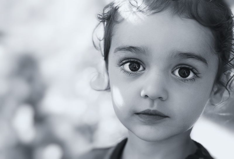
When you look at this photo of a little girl, your gaze is automatically to her eyes-- that’s the focal point. The dark irises are starkly contrasted to the white of the eyes (sclera).
What do you notice about the background?
It’s just a few blurry shadows and barely there at all. In fact, you probably didn’t notice it until I asked about it. That’s the sign of a background done right.
Can you imagine what would happen to the impact of this photo if it had one of those “use all the circles” backgrounds I’ve been seeing lately?
Let me show you:

(You’ll have to pardon my quick photo edit, but I think you get the idea.)
Now instead of a realistic portrait, we have some sort of new-age space photo. The circles are incredibly distracting and the eyes no longer have our full attention. Why? Because the background has just as much contrast as the eyes do.
The entire tone of the portrait has been altered--and not for the better.
Here’s another photo example with an ineffective background:

Notice that the level of detail in the background is similar to the level of detail in the subject. The colors are similar across the board, too.
We see similar values in the skin, hair, and face of the subject as we do in the background of the rock, stairs, and leaves. The reason this doesn't work is because our eyes are naturally going to focus where there is more contrast. The brightest, or lightest value, of this picture is the dress. So our eyes are immediately drawn there. It does nothing for the overall balance and composition and the focal point is uncertain.
A simpler background with less contrast would have created more focus on the portrait itself. I've done this in the edit below.

The same problem is happening in this photo:

The background in this shot is WAY too distracting.
Now that you’ve seen how this works in photography, you can apply the same concepts to your art.
My recommendation?
Don’t force the background.
If you can include a background that makes sense for your piece--one that is NOT distracting-- then go for it! Otherwise, just leave it out. Let the subject be the focal point no matter what!
***NOTE: All photos in this post are free to use commercially or personally without attribution.