portraits

Beginning with the Basics for Colored Pencil Portraits

BlogPostBanner.jpg

Stop Beginning At The End!

Portraits are some of the most striking pieces in colored pencil. When done well, the realism is breathtaking!

I can’t count the number of times I’ve heard someone say, “Is that colored pencil? But the people look so real! I didn’t know colored pencil could do that.”

Many artists (myself included) see colored pencil portraits and feel inspired to draw one themselves. They race off to the bookstore or start searching YouTube for a great tutorial, then wonder why their portraits fall short.

Why don’t my colored pencil portraits look realistic? Where did I go wrong? Can I even learn how to do this? What am I missing?

That last question is the most important! Most portrait tutorials are missing some of the most fundamental information needed to draw a truly realistic portrait: anatomy of the skull and face, angle and positioning variations, ideal proportions, and more.

It took me an embarrassingly long time to figure this out for myself.

But once I headed back to the beginning and did some of the necessary pre-work, I became comfortable with portraiture and began loving the results. My portraits started to come alive the way I had always wanted plus I was way more confident throughout my drawing process. I actually enjoyed the process!

That’s what I want for YOU. And, yes, it IS possible for you!

Welcome to the Portrait Prep Drawing Series!

In this series of lessons, I want to lead you through the all-important fundamental information. If you’re anything like me, you might think you can skip all of this stuff.

How to draw a line?? Anatomy? Head construction? Sounds like a waste of time-- I’ll just study photography and find great reference photos instead.

Not so fast, my friend! Learn from my mistakes, and begin at the beginning.

To create an appealing house, it’s essential to first build the frame before putting up the walls, painting, and decorating, right? Portraits are no different. To create a realistic portrait, you have to understand the underlying structure of the head before rendering the skin and hair and other features.

Follow along through the next few posts as I share with you some of the information I wish I’d had when I started drawing portraits. By the time we’re through, I want you to be so familiar with every possibility (face positioning, angles, and foreshortening of the features) that when you finally pick up your colored pencil, you will be ready to paint that final layer on a well-constructed head.

This article is the introduction to the Portrait Prep Drawing Series! Here’s the link to the first installment in this drawing series!

Want an even deeper look at drawing portraits? Sign up for my FREE Portrait Prep Drawing Course!  

Portrait Prep is a video course inside the Sharpened Artist Academy. Together we’ll walk through the core fundamentals of drawing incredible portraits.

Sound good? Click here to signup


What are your biggest challenges when drawing colored pencil portraits? Share in the comments below!


Portrait Prep Series: Beyond Basic Shapes

PC-L1.2.jpg

Welcome to the final portion of Lesson 1!  

Lesson 1.2

In our last lesson we talked about drawing edges instead of lines and the importance of training our eye to see relative size and proportions. We also touched on value scales and spoke about how to look at a sphere. If you missed it or need a refresher, click here to review.  

If you’re ready to join the Portrait Prep Course go here now! We’re starting the course June 1, 2020.

This time we’ll begin by creating a few more shapes:  first a triangle and a circle, then a cylinder to begin to see more depth.

We’ll use what we learned about a value scale to shade these objects and turn them into three-dimensional objects that can represent something in real life.

Triangles

Let’s start today with a triangle:

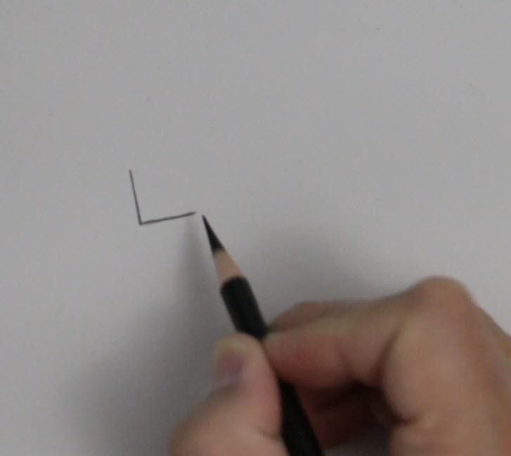
Draw your first vertical line….  

Vert-Triangle.jpg

...and then your horizontal line.  

Be sure that your second line (which should be horizontal) is the same exact length as the vertical line. These equal lines should form a 90° angle.

You should be able to identify where the diagonal line ought to go.

2017-10-30_20-38-18.jpg

You'll also start to notice the degree for the diagonal line. If your vertical and horizontal lines are 90° then your diagonal line should be around 45°.

If, however, the horizontal line is only half the width of your vertical line then your diagonal line will form a 30° angle. (See the examples below for a visual representation of what I mean.)

Create your own triangles and identify how the lines are related to one another!

2017-10-30_20-52-35.jpg
2017-10-30_20-53-58.jpg

Note:   How does this relate to portraiture? Good question! Consider the diagram below. I've drawn the lines for the mask of the face, the curvature of the head, and the outlines we would use to develop the entire head. See the triangle? What we're doing with this exercise is learning how to think about our subject matter in a very three-dimensional way.

2017-10-30_20-46-38.jpg

The line is from above the brow ridge to the ear hole (the external auditory meatus) next to the mastoid process.

Circles

Now let’s move on to a circle. Drawing a circle is actually not quite as difficult as you may think.  If you think about having four equal sides and then curve lines in between these points you should be able to draw a circle that is adequate enough to represent something that is circular in your portrait drawings.

Look at my diagram below and see if you can draw your own circle using the same method.

Create four dots evenly spaced apart, then add curved lines to complete the circle.

2017-10-30_21-00-09.jpg
2017-10-30_20-59-59.jpg

Note:  We will never escape the need to identify shapes in drawing portraits or anything that we draw. Seeing the shapes and being able to recognize the relationships between one edge and another edge, or from one object to another, is an integral part of being able to draw proportions correctly.

Cylinders

Finally, let’s add more visual interest by creating a cylinder.  

Step 1

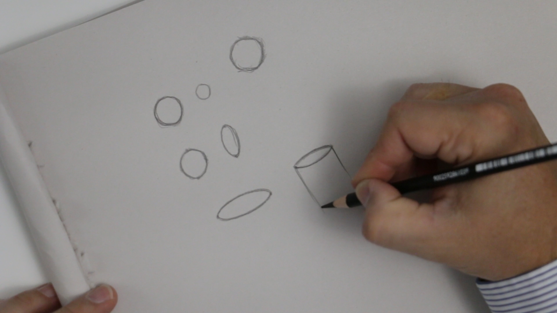
Create an ellipse:  Draw two target dots the width you want the cylinder to be, then draw a curved line between them.

MVI_0818.00_11_29_01.Still003.jpg
MVI_0818.00_11_45_02.Still008.jpg

Then repeat in the opposite direction to create a mirror image of the first curve.

MVI_0818.00_11_45_02.Still008.jpg
MVI_0818.00_11_49_10.Still010.jpg

Step 3

Create the final curved line at the bottom. You should notice that it's parallel to the lower half of your ellipse at the top.

MVI_0818.00_12_03_09.Still012.jpg

Step 4 - Optional Shading

You could shade in the cylinder at this point, but this is optional.  The most important part of this exercise is to be able to see all of these lines in relationship to the whole object, and to create the curved lines to appear realistic and three dimensional.

Shading a Circle into a Sphere

Remember the discussion of light and shading with the Styrofoam ball in the last part of Lesson 1? We’re going to use those same concepts when we talk about shading a circle into a sphere. Don’t forget: we'll have a hard edge, a soft edge, a cast shadow, and a highlight.

Step 1

Loosely sketch a circle.  

Create an imperfect circle to fill in with value. Don't worry that the circle may not represent a flawless ball shape--you can refine the edges of the circle to make it appear more round as you go.

CircleFillIn.jpg

Step 2

Keep adding value very lightly so that you ensure everything is in balance. As you progress, refine the shape of the circle to be more complete.   You CAN do this!

MVI_0818.00_23_03_04.Still016.jpg

Step 3


Determine the light source and begin diagramming.  

Diagramming is simply a fancy term for labeling the elements of a drawing so you can think about the names of those elements in the drawing process. This is a fantastic way to learn the subtleties involved! Your mind will begin to identify these things as being different from the other elements in your drawing.

MVI_0818.00_30_41_23.Still018.jpg

Follow this checklist to diagram your sphere:

  • Draw a light source icon

  • Label the highlight

  • Label the soft edge

  • Label the hard edge

  • Label the reflected light

  • Label the cast shadow

Step 4

The last elements to label are the values from the value scale that you created.  This is a highly effective way to determine if you’ve created a full range of values with very soft transitions.  You don’t want a hard edge where it doesn’t belong--like in the middle of the sphere!

Simply draw lines and label 1 through 10.  (I’ve grouped some of my numbers together to make it simpler, for example a 5 and 6 together and a 3 and 4 together.)  The point is to create a sphere that makes sense--NOT to make the most beautiful-looking sphere anyone has ever seen! (It’s an exercise, not a work of art.)

MVI_0818.00_35_24_08.Still019.jpg

We’re getting so close to our skull lesson where much of this will all be coming together!

Any questions about these exercises? Ask in the comment section!

PORTRAIT PREP SERIES: Lesson 2 The Skull, Muscle and Skin

PPC-Lesson2.0.jpg


Welcome back to Portrait Prep! (If you missed the previous lessons, you can find them here: IntroLesson 1, Lesson 1.2).


In this section, we're going to talk about the skull, the facial muscles, and the skin. These parts work together to form what we see as a complete face, so it’s important to get to know what’s going on under the surface to know how each part affects what we see.

The Skull

If you're using graphite and you're new to drawing the skull, remember to be patient with yourself and take it slow. Think more about the proportions of each of the areas you're drawing.

I typically start any drawing in the top left corner, move downward through the drawing, and end at the bottom of my subject and over to the right. I'm right-handed and I don't want to impair my ability to see what I've already drawn or smudge anything, so this method is effective for me.

To begin, draw a curve on the top right side to represent the major side plane of the skull in the cranium area. Next, make the same identical mark on the left side.

Once you have those two marks down pretty accurately, connect them at the top by another curved line which will serve as the top of the head.

The rest of the skull should be proportionate to the top part of the head.  Ultimately there is no right or wrong way to draw the skull, but everything needs to be relative in proportion to what you've drawn prior to your current marks.  If you find that your proportions are becoming out of scale to the rest of the drawing, simply erase and start that portion over.  (I’d like you to attempt to draw it just by eyeballing the proportions for now. In a later lesson, we will go over the measurements of the skull to make it even more proportionate.)

Pay careful attention to the zygomatic area in the frontal view and make sure that you don't overemphasize it. You might be tempted to make it stick out further than it already does, so be careful!  

Another cautionary area when drawing the skull is making the orbitals too circular and too close together.

You may also discover that you have a tendency to elongate the face area and make it seem much more vertical than it really is.

But remember: this part of the course is intended to be a series of exercises. You’re not creating fine art renderings to be entered into a contest or gallery.  This is simply sketching with a goal of improvement and training your eyes to recognize accuracy. 

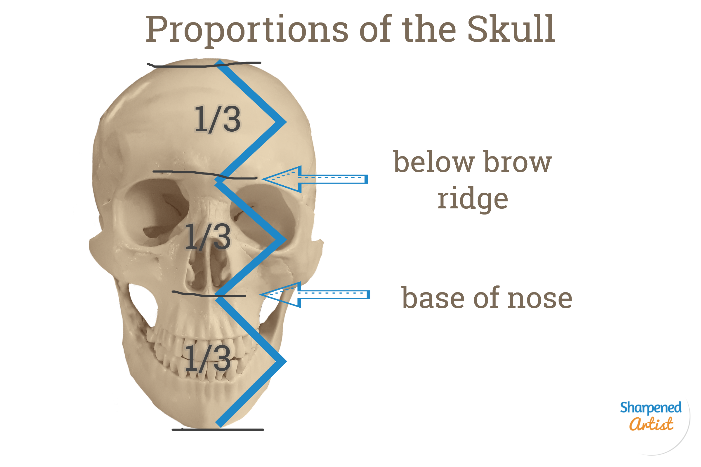
Check out the reference that I've provided here as a guide for creating your skull drawing.

Skull Proportions.png

You can also look at the quick sketch that I've done in the picture below.

It doesn't need to be elaborate at this point. Just have a basic understanding of where these anatomical landmarks are.

It doesn't need to be elaborate at this point. Just have a basic understanding of where these anatomical landmarks are.

(Portrait Prep Course students - you’ll refer to the "Drawing the Skull" video that was emailed to you.)

Muscles of the Face and Head

Now that we have a bit more background about the skull, let's move on to the muscles of the face and head.

If you're overly ambitious and have a lot of time on your hands, this would be an excellent time to learn all the muscles names that make up the face and head. If you’re like me and don’t have that much time to invest, don’t sweat it. All you really need is an understanding of where they are and how they relate to one another. 

There are a couple of areas that have some interesting formations in the face that you will want to notice, outlined in the pictures below. There are some rounded muscles in the eyes, for example. The mouth areas also have some curved types of muscles that affect the way the skin appears in the nose and in the forehead. And then there are some muscles that overlap each other and come together in separate places of the face: the corners of the mouth and some areas in the neck. 

Use the reference below to create a line drawing of the muscles of the head. This will help you gain a better grasp of where these muscles are and how they're positioned in the face. 

Original image can be found at: https://en.wikipedia.org/wiki/Facial_muscles

Original image can be found at: https://en.wikipedia.org/wiki/Facial_muscles


Skin

The last part of this section is a very brief look at the outer layer of the skin. That layer is affected by certain landmark areas in relationship to the skull and muscles underneath.


Some of the most important areas to study skin positioning are the eyes, the mouth, and the nose.


The eyes:

The eyeball itself is positioned higher up inside the eye socket. The eyelid actually closes over the upper part of the eye where the top lid will meet the lower lid and produce most of the movement. This is the reason why there are often shadows on the lower portion of the eyeball (the sclera). 

The mouth:

The mouth is more of a cylinder shape and is heavily influenced by the muscles that surround it immediately under the surface.  The muscles get their overall contour from the skull (particularly the teeth, maxilla, and glabella).

The nose:

The nose has a curved area that covers the cartilage.  While the length and side planes of the nose may not seem all that difficult to draw, the underlying structure and make-up of its anatomy is anything but simple.

In conclusion, I hope that this lesson has helped you become more aware of the underlying anatomy of the head and face. When we start to draw a more serious rendering with colored pencil (or another medium of your choice), this knowledge should come back to you and inform your decisions.

We want the knowledge to be sub-conscious and automatic so that we don’t have to think about it when we draw.  We are working towards understanding WHAT we draw so that we can draw what we know.  So we're trying to get past drawing what we see. 

Have a question or discussion point about this info? Sound off in the comments!

You Actually CAN Erase In Colored Pencil


When I first started drawing, I was like most beginner artists and used only graphite and charcoal. When I discovered colored pencils, it felt like everything clicked. Suddenly, my drawings had the potential for greater versatility and depth. I'd hit the jackpot!

All those feelings of excitement quickly drained away the first time I tried (and failed) to erase the way I had been used to. Was it possible that colored pencil wasn't the versatile medium I had hoped it would be? Was my art career over before it even started? Would I be better off giving up entirely?

Obviously, I needed a little pep talk and some research.

In time, I learned several erasing methods that give me more freedom and options. Thank goodness I didn't call it quits, because you CAN erase colored pencil--and it isn't even difficult!

To keep you from despairing like me, I've put together this little tutorial to show you some steps to keep unwanted marks off the paper:

Method number 1--Use a Light Hand

Using a light hand (also called light pressure) when applying the pencil is the first method I recommend.  To do this, hold the pencil comfortably in the tripod position. Keep your grip loose enough for the pencil to graze the surface of the paper using its own weight alone.  Holding the pencil further down the shaft (opposite the point) will help you do this.  If you use a soft touch and you’re careful not to burnish your paper too early, then you can erase marks if you need to.
 

Why it’s important:  

Keeping a light hand not only helps with getting tons of layers down but it also helps you to erase the pigment if you need to.  If you press very hard and grind the pigment down into the paper, it simply cannot be removed.  Are you a burnisher? No problem.  Go ahead and burnish, but wait to do it until the very end when there is nothing more to do on the drawing.
 

Method number 2--Work in layers
 

Build up the layer 1 to 2 colors at a time all over the areas in your drawing.  Only after you’ve done one layer of color everywhere will you move to the next color. Repeat the process of building up the next layer slowly and gradually, and keep the point of your pencil sharp the entire time.  Keep a test sheet of paper next to your drawing and take notes on order in which you laid down the pencil colors.
 

Why it’s important:
 

When you remove or erase areas of pigment in a certain area, you'll need to build the pigment back up in that small area using the same process as the section surrounding it. Without detailed notes about the colors you used and the order you layered them, you may find yourself constantly building up color in a fruitless effort to remember how you achieved your original look.
 

Method number 3--Erasing with Tap-Lift-Scrub

Like a boxer in the ring using 3 types of blows against his opponent, you also have to go at this removal process in these 3 creative ways.  

First, tap with a kneaded eraser or poster tack. If you’ve followed the first 2 methods then your pigment will be easy to erase! The idea of tapping is to gently touch the paper with the sticky adhesive of the kneaded eraser and allow the pigment to be lifted from the surface.  It seems to be more effective if you do this gently and keep moving your eraser to a clean area.  

Keep in mind, there is a law of diminishing returns with this method.  If you’ve done it a number of times and you notice that there isn’t anymore pigment coming off, then it is time to move on to part 2 of this erasing method.  In the lift approach, you can take Scotch tape and apply a small bit to the area. Press it down gently with the tip of the pencil and then lift up on the tape and you’ll see more pigment magically disappearing.  It's known as 'magic tape' for a reason!

Here’s a portrait I was working on recently where I used this very method to correct problems I had with the black pigment in the eyelashes. I followed these simple steps and I was back on track in no time.

eyelashes.jpg


If these first two methods don't work, go ahead and try the third choice as a last resort. This option involves using a synthetic eraser or plastic eraser to remove any last pieces of the pigment that have become a stubborn stain on the paper. There are also effective battery-operated erasers that make this process even faster and offer a lot of control.

So there you have it--  three ways to use whatever drawing techniques you like while enjoying the freedom to erase. What more could an artist ask for?

The Power Of Middle Values In Portraiture

Middle Values Can Make Or Break Your Artwork

As an artist, I often get questions from people about their own drawings. One of the things I hear over and over again is, “How do I get my drawings to look more realistic?” This question is usually followed by an exasperated sigh, as if the budding artist is close to giving up.

This was an early shot of a commission (from a badly out-of-focus reference I might add) I was working on some time ago.

You can see that the face is all rendered in monochromatic values with no color applied yet. The only pencil color I'm using is Bark, Inktense, from Derwent.

Conventional wisdom would tell you not to create a line for something that should be represented as a curve or an edge, opting to use shading to represent everything instead (even where you think there is a line). This is very good instruction for achieving more realistic drawings, as it will call your attention to shape, size, proportion, and relationships to negative space. These are all good things to be aware of.

But I think the most realistic drawings come when an artist develops the ability to see value changes and differences in the middle values. The average joe can usually tell the difference between the darkest values and the brightest values, but to go beyond that and start to make judgments in the middle values will bring your drawing to a whole new level.

I know what you’re thinking—Sure, John, sounds great. But how in the world do I learn how to look at middle values? I’m so glad you asked!

One way to do this is to begin using a technique from the old masters called the grisaille (pronounced GRIZ-EYE) method. (This has nothing to do with a grizzly bear, or its eye… though that would make an interesting drawing.) In the grisaille method, you render your entire drawing by reducing down to values. For example, if I am drawing a colored pencil portrait then I will first draw the entire drawing using 1 or 2 pencils colors. I will only use light pressure in the lightest areas. I will cover the entire face with the pencil and will not go on to until I cover the entire face.

Think about the drawing process using these 3 steps:

  1. Outline. Create a very soft (nearly invisible) outline of the proportions. The outline of the face, the edge of the hair line, the outline of the eyes, then nose and mouth.

  2. Go Dark. Next, gently increase the value of all the areas where you see shadows. For example the corners of the mouth, the corners of the eye, the underside edge of the nose.

  3. Make the Middle. Finally, with a very dark pencil and with the lightest touch you can possible make increase the value in areas that you consider the middle values. Here is where the magic will begin to happen. By “lightest touch possible” I mean that the only pressure you exert in nearly just the weight of the pencil itself and you are only controlling the direction of the tip! EXTREMELY light touch. Imagine that the paper is a pressurized bomb and if you press too hard it will blow up in your face. Ok, that was extreme. You get my point, right?